 Koala UI
Bento
An asymmetric marketing grid of feature tiles. Named parts you assemble: a tinted icon, a balanced title, a description and a media region. Each tile claims a size and a tone, and the grid collapses to one column.
Store templates
Crafted layouts that highlight product benefits, build trust, and drive conversion.
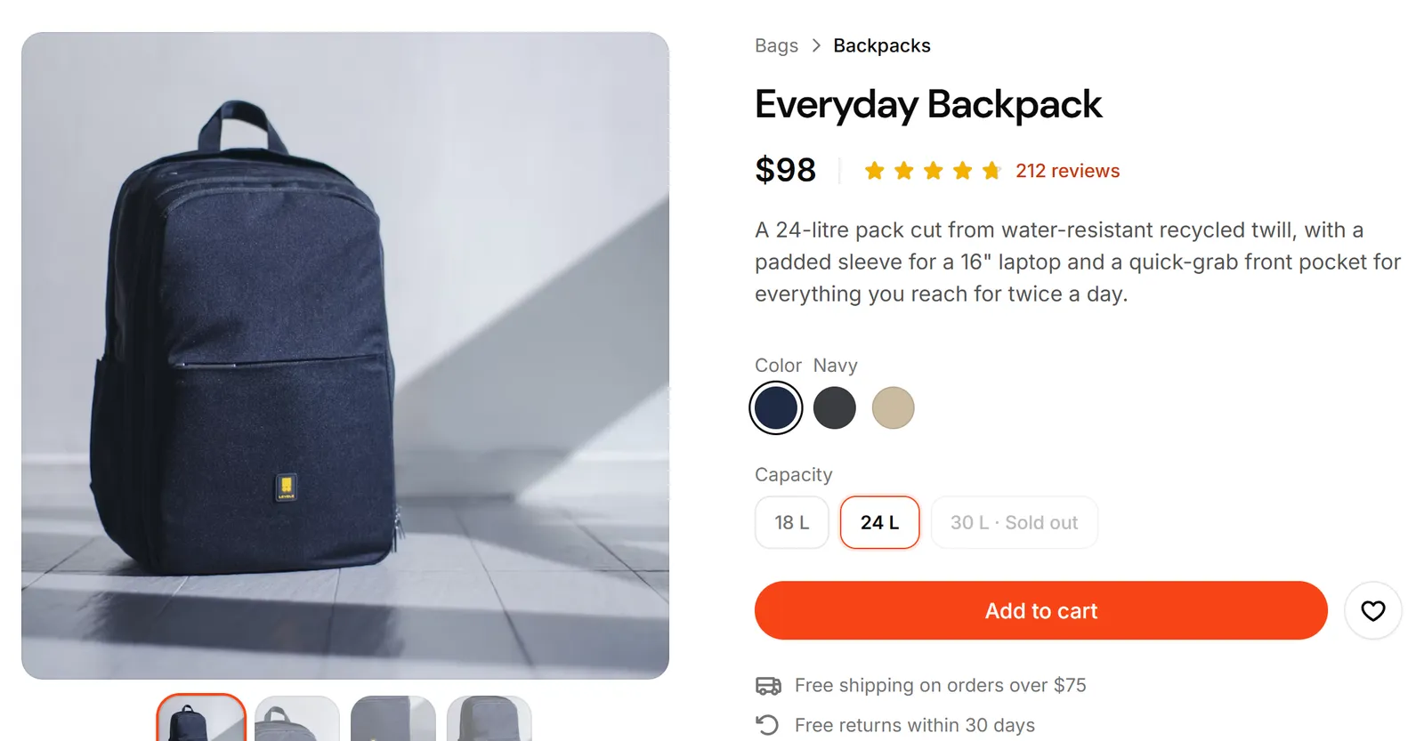
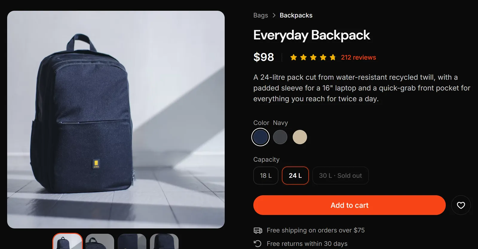
High-converting experience
Structures meticulously created for maximum conversion and end-to-end purchasing.
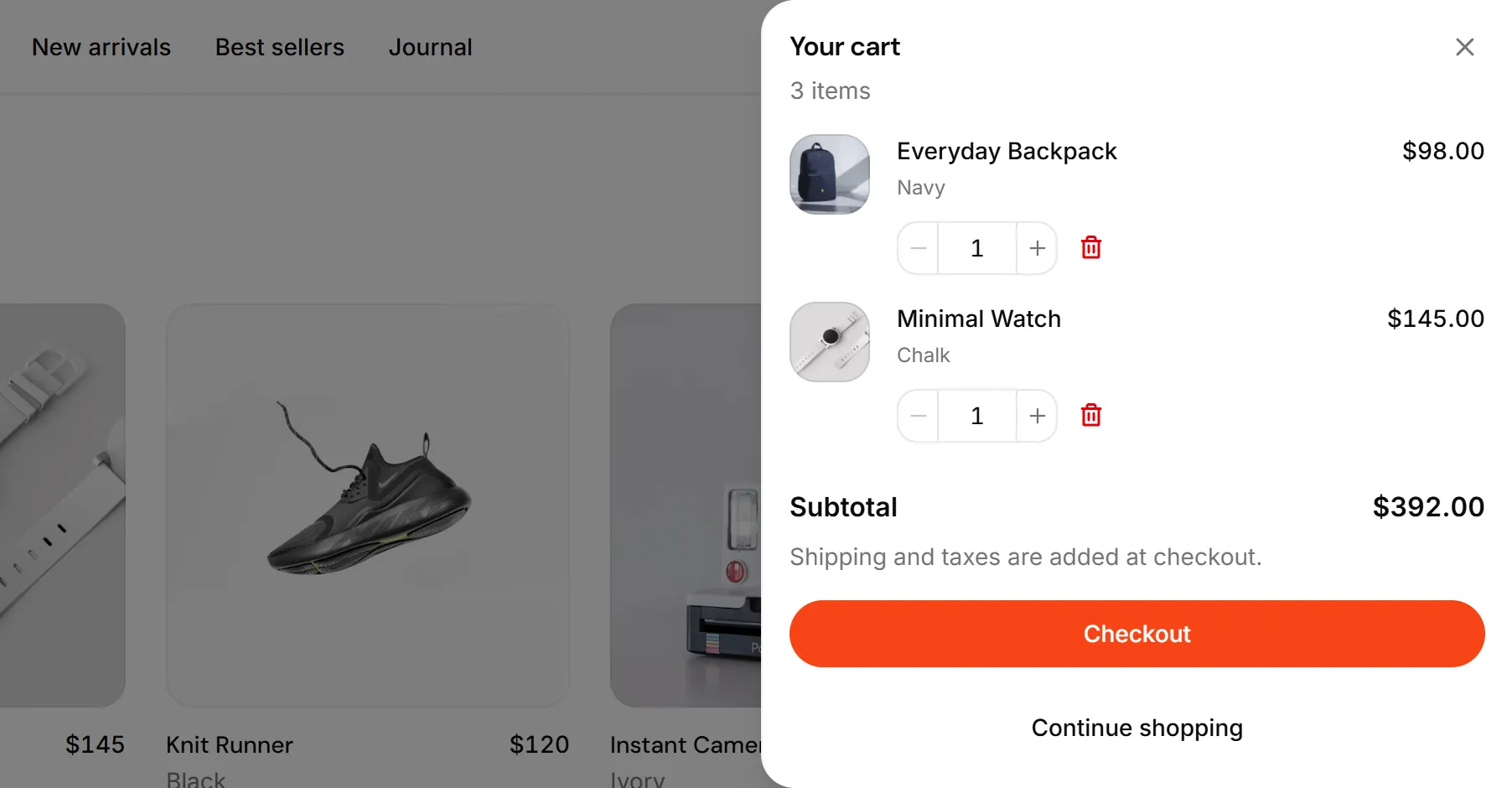
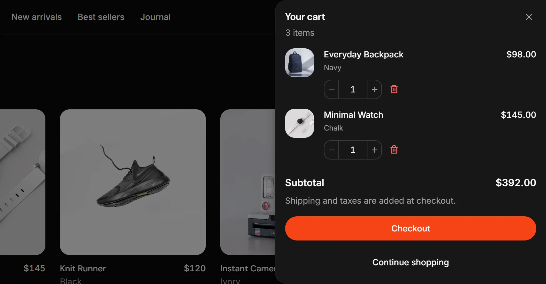
Maximum personalization
Customize the components to your liking so that each project is unique.
Detailed documentation
Maintain consistency across projects thanks to our extensive documentation.
All assets in 1 place
Logos, avatars, flags, and icons ship ready to drop into any page.
Installation#
Usage#
import {
  Bento,
  BentoItem,
  BentoItemIcon,
  BentoItemTitle,
  BentoItemDescription,
  BentoItemImage,
  BentoItemMedia,
} from "@/components/ui/bento"

// Your own screenshots, one per theme.
import storeLight from "@/public/shots/store-light.webp"
import storeDark from "@/public/shots/store-dark.webp"

<Bento>
  <BentoItem size="md" tone="brand">
    <BentoItemIcon><Storefront /></BentoItemIcon>
    <BentoItemTitle>Store templates</BentoItemTitle>
    <BentoItemDescription>Crafted layouts that drive conversion.</BentoItemDescription>
    {/* A screenshot that peeks up from the bottom edge, in the page's theme. */}
    <BentoItemImage src={storeLight} darkSrc={storeDark} alt="A storefront product page" />
  </BentoItem>
</Bento>Sizes#
Each BentoItem picks a size: sm (2 cols), md (3 cols), lg (4 cols), feature (4 cols × 2 rows, the anchor tile), and full (the whole row). Below the lg breakpoint the grid collapses to two columns, then one, so every tile stays legible on mobile.
Collapse#
collapse on Bento picks where the grid leaves one column. The default, sm, steps through two columns before the six. lg holds one column until lg: reach for it when a row holds three tiles, because a two-column step can only lay a row of three out as a pair and an orphan. The tiles read the choice from the grid, so a wide tile never forces a second column into a one-column grid. Narrow the window to see the difference.
Image fit#
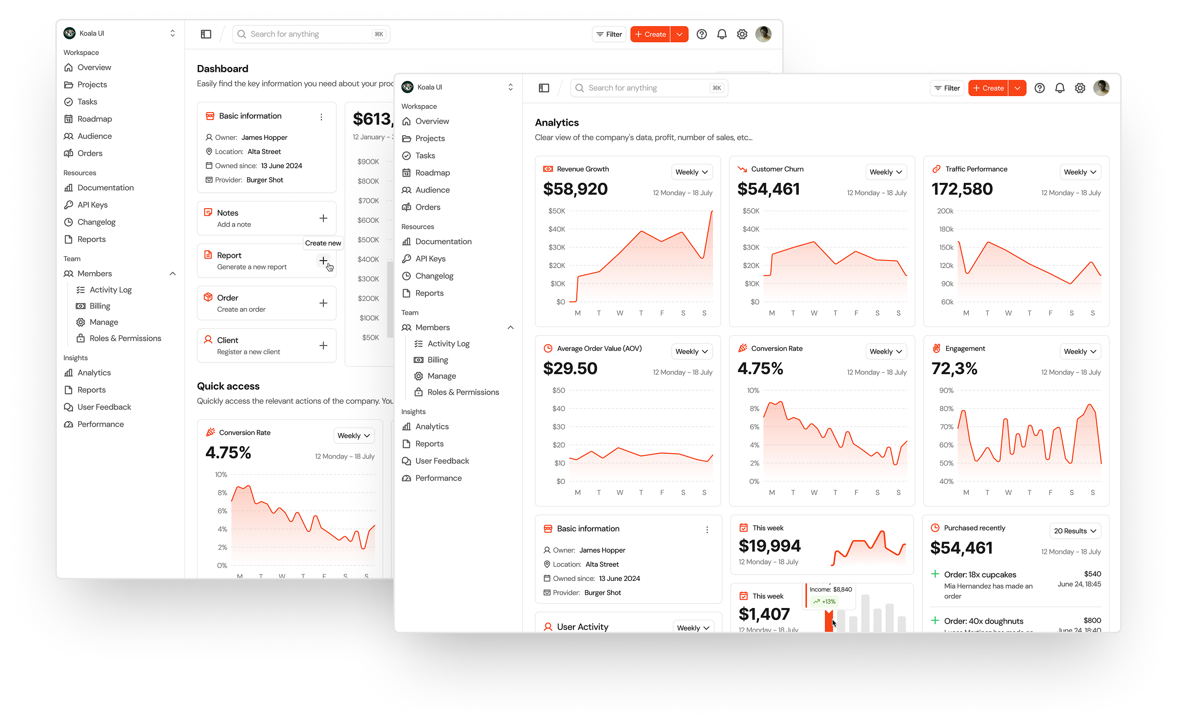
imageFit decides what a BentoItemImage is. frame (default) floats the shot in a window: inset by the tile padding, top corners rounded, lifted off a muted ground. bleed drops the window: the art is larger than the tile, pinned to the copy's left edge, and runs off the right and bottom edges, dissolving through the fade-b mask into whatever ground the theme gives it. Set it once on Bento; a tile's own imageFit wins.
Product Design Templates
Create concepts for products or applications with over 200 templates and components.
Framed, for contrast
The same art in the default window: inset, top corners rounded, lifted off a muted ground.
Light and dark shots#
A screenshot is taken in one theme, and a framed window is the first thing that gives it away: a white shot on a dark page reads as a mistake. Pass the same shot taken in a dark theme as darkSrc and BentoItemImage shows src on the light themes (light, cream) and darkSrc on the dark ones (dark, moonlight). The swap is the dark: variant, so it follows the nearest theme, a pinned band included, and only the shot on screen is downloaded. Every other prop applies to both.
High-converting experience
srcHigh-converting experience
darkSrcLive art#
A shot is one take of one moment. When the moment should follow the visitor's theme and accent, move, or answer a click, put the real components in the window instead. BentoItemArt is the same art window a BentoItemImage paints into, framed by default and bled under imageFit="bleed", with your composition inside. Position it yourself: the window clips it, and a bled window is wider than the tile, so anything past the tile's edge is cut there.
Scale#
scale on Bento is the board's type and spacing step. md (default) is a block among many: 24px tiles, 16px descriptions. lg is the landing board a home page tells its feature story with: 32px tiles, a 32px step to the art, and 18px descriptions. The title stays 8px from its description at both steps, and the bleed cancels the bigger padding. Set once on the grid, so a board never mixes steps.
Product Design Templates
Create concepts for products or applications with over 200 templates and components.
High-converting experience
Structures meticulously created for maximum conversion and end-to-end purchasing.
API reference#
Bento
The grid container: one column on mobile, two at sm, six at lg. collapse is "sm" (default) or "lg", which skips the two-column step; imageFit sets the default for every tile; scale is "md" (default) or "lg", the landing step. Forwards native <div> props and className.
BentoItem
One tile. size is "sm" (default), "md", "lg", "feature", or "full"; tone is "brand" (default), "purple", "teal", "orange", or "pink" and tints the icon; imageFit is "frame" (default) or "bleed" and overrides the grid's. Pass asChild to render the whole tile as a link.
BentoItemIcon · BentoItemTitle · BentoItemDescription
The tinted icon chip (pass one Phosphor icon as the child, tone inherited from the tile), the balanced <h3> title, and the muted <p> description.
BentoItemImage
A screenshot clipped at the tile's edge: a framed window peeking up from the bottom, or bleeding art with imageFit="bleed". A plain lazy <img> that fills the window, so it runs in Next, Vite or any React app: pass src (a URL or a static image import) and alt, plus darkSrc for the dark themes' take of the same shot; its height (and the bleed's width) follows the tile size and is overridable via frameClassName. Children are extra layers inside the window (a floating panel over the shot), positioned by you and clipped and dissolved with the art.
BentoItemArt
The art window with live children instead of a picture: framed or bled by the tile's imageFit, with the same height (and bleed width) per size as BentoItemImage. Position the composition inside it yourself; the window clips it. Forwards native <div> props and className.
BentoItemMedia
A freeform bottom-aligned region (mt-auto) for anything that isn't a peeking image: a stat, a swatch row, or custom markup. Media edges line up across tiles in a row. Composed first, it flips: the visual sits at the top and the title and description settle on the bottom edge.