 Koala UI
Gallery
A marketing concepts wall: a balanced headline and lead, an optional tab rail to switch template categories, and a full-bleed fake-masonry of framed preview tiles. Our own Tabs, plus plain CSS columns.
Installation#
Usage#
import {
  Gallery, GalleryHeader, GalleryTitle, GalleryDescription,
  GalleryMasonry, GalleryItem, GalleryImage,
} from "@/components/ui/gallery"

const PHOTOS = [
  { src: "https://images.unsplash.com/photo-1497366216548-37526070297c?w=800", alt: "Open-plan office", ratio: "aspect-[4/5]" },
  { src: "https://images.unsplash.com/photo-1522071820081-009f0129c71c?w=800", alt: "Team at a table", ratio: "aspect-[3/2]" },
  { src: "https://images.unsplash.com/photo-1519389950473-47ba0277781c?w=800", alt: "Laptops on a desk", ratio: "aspect-square" },
]

export function Example() {
  return (
    <Gallery>
      <GalleryHeader>
        <GalleryTitle>Inside the studio</GalleryTitle>
        <GalleryDescription>A week of work, in pictures.</GalleryDescription>
      </GalleryHeader>
      <GalleryMasonry>
        {PHOTOS.map((photo) => (
          <GalleryItem key={photo.src}>
            <GalleryImage src={photo.src} alt={photo.alt} className={photo.ratio} />
          </GalleryItem>
        ))}
      </GalleryMasonry>
    </Gallery>
  )
}
Without tabs#
Tabs are an optional composition. Drop the Tabs wrapper and render a single GalleryMasonry directly inside the section for a plain heading-plus-wall layout.
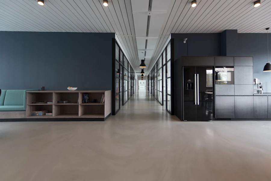
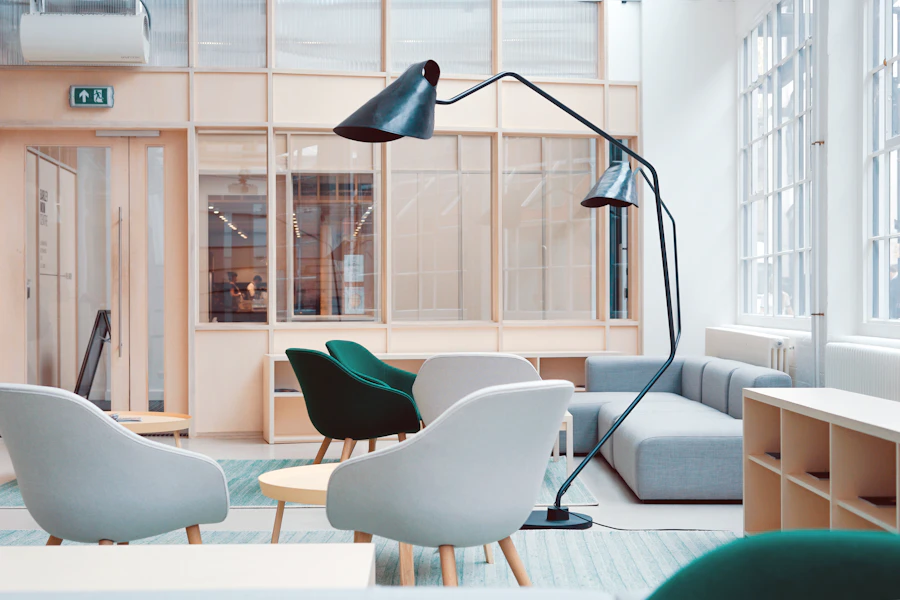
From our customers
A wall of real projects shipped with Koala UI, laid out as a fake masonry.

















As an accordion#
One more gallery layout: instead of a wall, present the work as a vertical index of collections. Each row previews itself with a peeking thumbnail stack and opens, on click, to a caption and a strip of framed photos that stagger in. It is built on our Accordion (Radix keyboard and ARIA), so only one collection is open at a time. Compose the parts with GalleryAccordion and friends.
density="compact" tightens the rows for a denser index. The open chapter is controlled with value / defaultValue / onValueChange, and opens on click or keyboard, never hover.
API reference#
Gallery
The full-bleed <section> that provides the styling context and clips the masonry's outer tiles at its edges (overflow-hidden). Forwards native section props.
GalleryHeader · GalleryTitle · GalleryDescription
The centered lede column and its balanced <h2> + muted lead paragraph. Place a Tabs rail inside the header to switch concept sets.
GalleryMasonry
The fake-masonry wall — plain CSS columns (2 → 3 → 4 across breakpoints), so varied natural image heights do the staggering. Wider than the gutter by default; override className to retune the column count or width.
GalleryItem
One framed tile: a concentric-radius card that lifts and deepens its shadow on hover. Accepts asChild to render as a link while keeping the tile styles.
GalleryImage
The preview image; fills its tile and gently scales as the tile is hovered. Defaults to a lazy-loaded, non-draggable image with an empty alt — pass a real alt when the image carries meaning.
GalleryAccordion · GalleryAccordionItem · GalleryAccordionTrigger
The accordion layout (see “As an accordion”). The root is a value-controlled Radix Accordion (type="single", collapsible) with density / size; each GalleryAccordionItem needs a unique value. The trigger takes tagline, count, and a peek stack, and draws its own + toggle. Opens on click/keyboard, never hover.
GalleryAccordionPeek · GalleryAccordionContent · GalleryAccordionCaption · GalleryAccordionMedia · GalleryAccordionImage
GalleryAccordionPeek is the overlapping thumbnail stack on a closed row (it fades out on open). The panel holds an optional Caption over a Media strip of framed GalleryAccordionImage tiles that stagger in; give a tile overlay for a +N badge or action to make it an interactive button that pairs with Lightbox.