 Koala UI
Promo Card
The in-app feature promotion for dashboards: a product eyebrow, a short pitch and one quiet action, beside a framed peek of the feature that runs off the card's edge and dissolves into it.
Turn delivered work into compliant invoices and follow each one until the payment clears.
Installation#
Usage#
Promo Card is composed from named parts, like Card. The PromoCard root owns the surface, the density and the open state; PromoCardContent is the copy column and PromoCardMedia the peek beside it.
import {
  PromoCard,
  PromoCardContent,
  PromoCardEyebrow,
  PromoCardTitle,
  PromoCardDescription,
  PromoCardActions,
  PromoCardMedia,
} from "@/components/ui/promo-card"
import { Button } from "@/components/ui/button"
import { BrandMark } from "@/components/landing/brand-mark"

export function AnalyticsPromo() {
  return (
    <PromoCard>
      <PromoCardContent>
        <PromoCardEyebrow>
          <BrandMark wordmark={false} />
          Analytics
        </PromoCardEyebrow>
        <PromoCardTitle>Your whole workspace on one screen.</PromoCardTitle>
        <PromoCardDescription>
          Revenue, subscriptions and churn side by side, refreshed every hour.
        </PromoCardDescription>
        <PromoCardActions>
          <Button variant="secondary">Open dashboard</Button>
        </PromoCardActions>
      </PromoCardContent>
      <PromoCardMedia>
        <img src="/analytics.webp" alt="" />
      </PromoCardMedia>
    </PromoCard>
  )
}Variants#
default is a contour with no fill, so it sits on whatever ground the dashboard has. muted and brand are deliberate tints that set a promo apart from the data cards around it, and elevated fills and lifts for a promo that floats over a busy page.
defaultShare one link, and every booking lands on the right calendar with a reminder attached.
mutedA live funnel from pricing to purchase, with the step that leaks the most flagged for you.
brandPick a trigger, chain the follow-ups, and let the workflow run until the invoice is paid.
elevatedTurn delivered work into compliant invoices and follow each one until the payment clears.
Media#
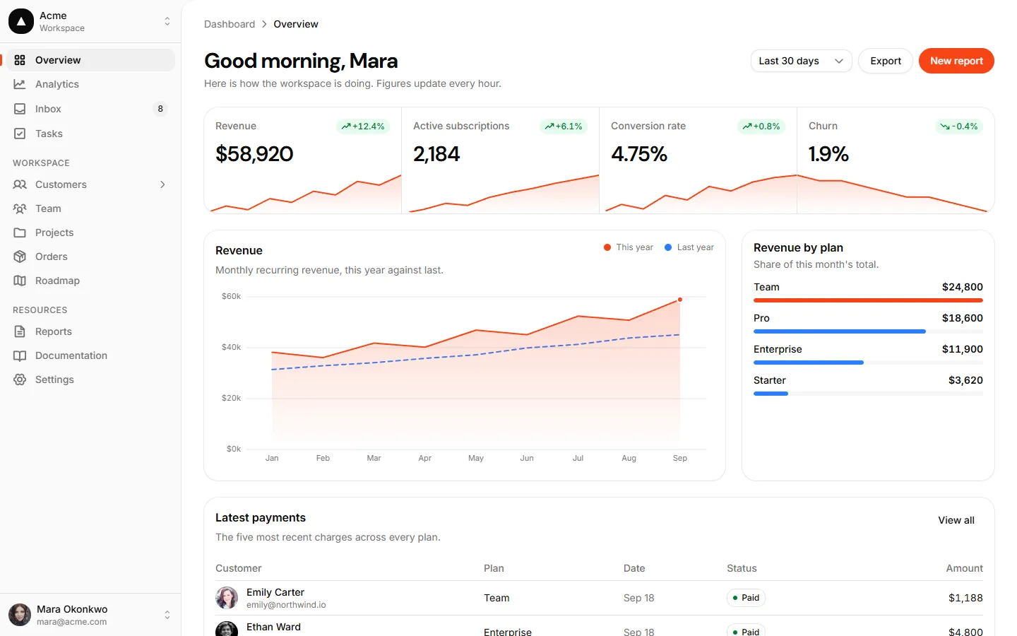
The peek is a tray with a screen inside it. It starts on the eyebrow’s line, runs off the right and bottom edges, and fades out to the right through a mask, so it dissolves into any theme’s ground. Put live components in it (every example above is built from DS parts) or an <img>, which fills the screen from the top-left. On a phone the peek stacks under the copy and holds its own aspect ratio. It is a picture of the product, so it is aria-hidden and inert by default.
Revenue, subscriptions and churn side by side, refreshed every hour.
Without media#
Every part can be left out. Without a PromoCardMedia the card collapses to one column and drops its resting height; without an eyebrow the pitch still lands on the same baseline. Two text-only promos fit side by side in a dashboard row.
Share one link, and every booking lands on the right calendar.
Pick a trigger, chain the follow-ups, and let the workflow run until it’s paid.
Dismissible#
Add a PromoCardClose and the card can be dismissed: it fades out with a slight settle, then leaves the tree. The root works uncontrolled out of the box; pass open and onOpenChange to keep the choice, which is where a dashboard stores “don’t show this again”.
A live funnel from pricing to purchase, with the leakiest step flagged for you.
Density#
Density is Koala’s cross-cutting spacing axis (see Density). For Promo Card it tunes the padding, the resting height and the type step. compact is the app default; comfortable gives an onboarding or empty dashboard more room. The peek re-aligns to the copy at both.
compactTurn delivered work into compliant invoices and follow each one until the payment clears.
comfortableTurn delivered work into compliant invoices and follow each one until the payment clears.
API reference#
PromoCard forwards all div props and adds variant (default | muted | brand | elevated), density (compact | comfortable), open, defaultOpen and onOpenChange. PromoCardContent, PromoCardEyebrow, PromoCardTitle and PromoCardMedia forward div props. The eyebrow leads with your app’s mark: in Koala that is <BrandMark wordmark={false} />; for another product, put its logo <img> in PromoCardIcon, which forwards span props and sizes the image like the BrandMark tile. PromoCardDescription forwards p props. PromoCardActions adds size (default sm), imposed on the buttons inside. PromoCardClose takes Button props and an aria-label (default “Dismiss”). Every part accepts className, merged last.