 Koala UI
 Best seller
East Fork
Speckled Cereal Bowls, Set of 2
1,284 reviews
$48
A product an assistant found for you, in its reply. The photo sits inset in the card, the store and the price are one glance apart, and a line from the assistant says why this one fits. The whole card links out to the store.
The preview is yours to explore. Its code comes with a Pro license, paid once and used in every project.
Have a license? Unlock it here
Two blocks. The media frame, with the badge and the save toggle anchored to its corners. The content column: store, title, rating and price. Drop any part you do not have; the card closes up around the rest.
import {
  ProductCard,
  ProductCardMedia,
  ProductCardBadge,
  ProductCardSave,
  ProductCardContent,
  ProductCardStore,
  ProductCardTitle,
  ProductCardRating,
  ProductCardPrice,
} from "@/components/ui/product-card"

<ProductCard>
  <ProductCardMedia>
    <ProductCardBadge />
    <ProductCardSave />
  </ProductCardMedia>
  <ProductCardContent>
    <ProductCardStore />
    <ProductCardTitle />
    <ProductCardRating />
    <ProductCardPrice />
  </ProductCardContent>
</ProductCard>Hover hints at the lift: the card rises 2px and its shadow grows a step, nothing more. The link covers the whole card, so a click anywhere opens the store in a new tab, and keyboard focus rings the card itself.
ProductCardBadge is one short label on the photo: a deal, a best seller, handmade. Leave it out when nothing stands out; a badge on every card stops meaning anything.
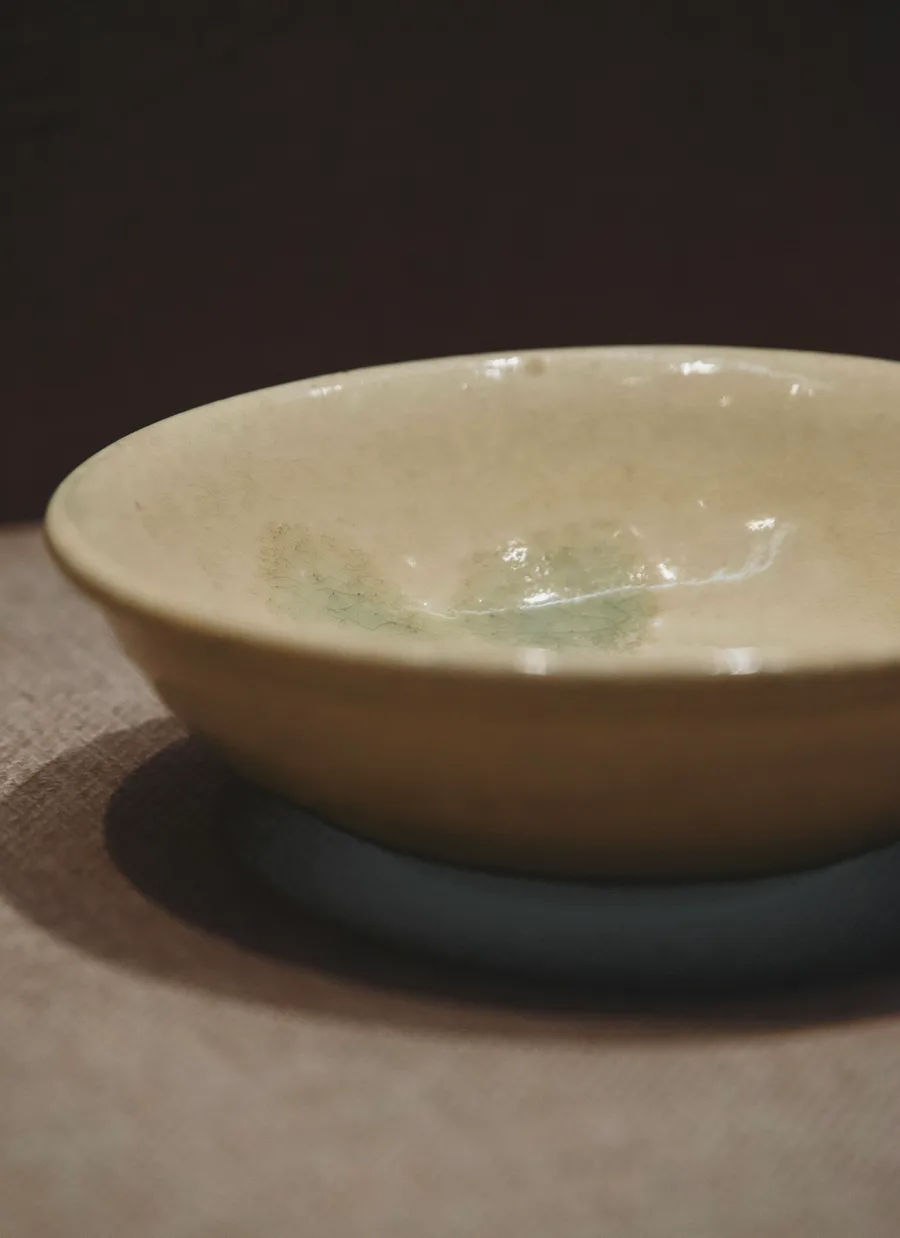 Handmade
$34
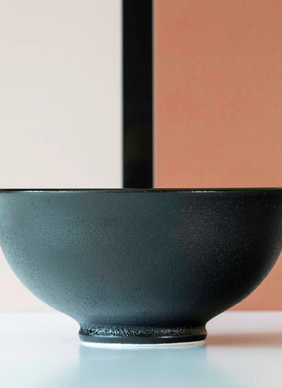
$58
Pass the list price as compareAt and the card shows the discount: the price takes the sale tone and the old one follows it, struck through. Both are formatted for the locale and set in tabular figures, so a row of prices lines up.
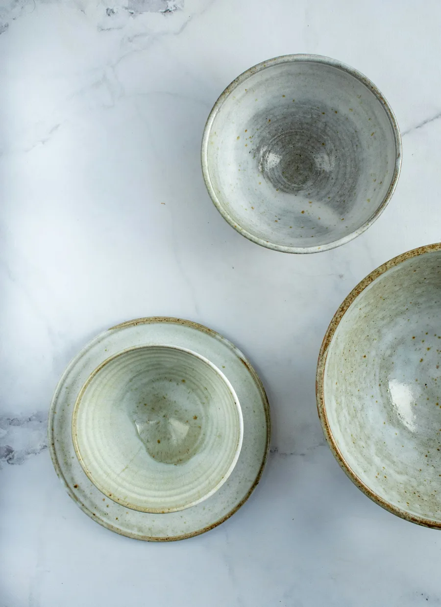 -20%
Now $52, was $65

$39.95
The heart is a toggle. Saved, the glyph fills in at full ink rather than turning red or brand, the same way every selected state in Koala reads. The fill grows out of the outline and resolves from a blur, so the change is felt without a bounce.
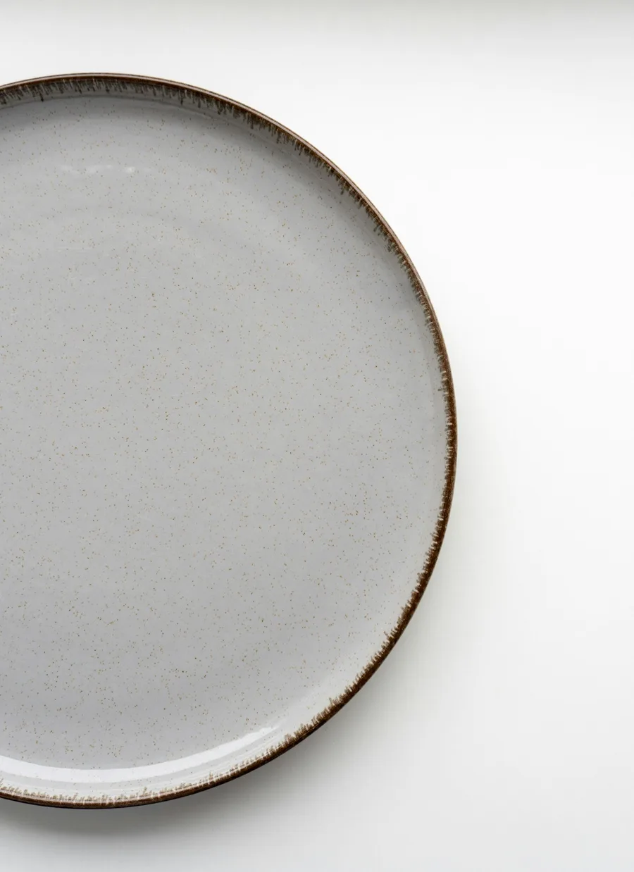
$28
$48
orientation="horizontal" puts a square thumbnail beside the details. Use it for a single pick in a reply or a short list, where a column of tall cards would push the answer off screen.
Best seller$48
-20%Now $52, was $65
While a result streams in, ProductCardSkeleton holds its place in the same frame, with the photo and the lines where they will land.
The card and the context every part reads. With href the whole card links out through one overlay link, labelled by the title and the store. Every part accepts className, merged last, and every part is droppable. Forwards native <article> props.
| Prop | Type | Default | Description |
|---|---|---|---|
| href | string | - | The product page. Makes the whole card a link and turns on the hover lift. |
| target | React.HTMLAttributeAnchorTarget | "_blank" | Where the link opens. A new tab by default, announced in the link's name, with rel="noopener noreferrer". |
| linkLabel | string | - | Overrides the link's accessible name, which is otherwise the title, the store and "opens in a new tab". |
| orientation | "vertical" | "horizontal" | "vertical" | vertical stacks the photo over the details, for a row of results. horizontal puts a square thumbnail beside them, for a single pick or a list. |
| Data attribute | Description |
|---|---|
| data-orientation | The card's orientation. |
The photo, inset 8px into the card with a concentric radius and a hairline edge. Square by default; the frame owns the ratio, so pass an aspect-* class to change it. Badge and Save anchor to it. Forwards native <div> props.
| Prop | Type | Default | Description |
|---|---|---|---|
| src | string | - | The photo, cropped to fill the frame. Any host works: the card renders a plain <img>. |
| alt | string | "" | Describe the product: color, material, what is in the shot. |
| srcSet | string | - | Responsive sources, so the browser picks one the width of the card. |
| sizes | string | "(min-width: 768px) 240px, 60vw" | Used with srcSet. |
| loading | "eager" | "lazy" | "eager" | Eager by default: a card slid into a carousel is moved by a transform, which the browser does not count as scrolling it into view, so a lazy photo would stay blank. |
| children | React.ReactNode | - | The overlays, or your own <img> or <video> instead of src. |
A pill over the top-left corner of the photo: a deal, a best seller, handmade. A Badge in the overlay tone, so it forwards Badge props.
| Prop | Type | Default | Description |
|---|---|---|---|
| variant | BadgeProps["variant"] | "overlay" | The tone. overlay reads on any photo. |
| size | "sm" | "md" | "lg" | "sm" | The Badge size. |
The heart in the top-right corner of the photo. A Radix Toggle, so it is a button with aria-pressed, and its name is the action plus the product title. Saved reads in ink, never in brand: the glyph fills at full strength.
| Prop | Type | Default | Description |
|---|---|---|---|
| saved | boolean | - | Controlled saved state. |
| defaultSaved | boolean | false | Initial saved state, uncontrolled. |
| onSavedChange | (saved: boolean) => void | - | Called when the heart is toggled. |
| label | string | "Save" | The action's name while unsaved. |
| savedLabel | string | "Saved" | The name while saved. |
| Data attribute | Description |
|---|---|
| data-state | on while saved, off otherwise. |
The details column under the photo, or beside it when horizontal. Forwards native <div> props.
Where it is sold: a 16px favicon and the store name, in the quiet eyebrow tone. A favicon that fails to load falls back to a storefront glyph. Forwards native <div> props.
| Prop | Type | Default | Description |
|---|---|---|---|
| favicon | string | - | The store's favicon URL. |
| logo | React.ReactNode | - | Your own mark instead of a favicon, at 16px. |
The product name, clamped to two lines. Labels the card's link. Forwards native heading props.
| Prop | Type | Default | Description |
|---|---|---|---|
| as | "h2" | "h3" | "h4" | "p" | "h3" | The element, to fit the heading outline of the page. |
The star Rating, read only, with the average and the review count beside it, all in tabular-nums. Announced as one phrase. Forwards native <div> props.
| Prop | Type | Default | Description |
|---|---|---|---|
| value* | number | - | The average rating. Fractions fill part of a star. |
| count | number | - | The number of reviews, formatted with thousands separators. |
| max | number | 5 | The number of stars. |
| locale | string | "en-US" | The locale the count is formatted in. |
The price in tabular-nums. With a higher compareAt, the price turns to the sale tone and the old one sits after it struck through; screen readers hear "Now" and "was". Forwards native <p> props.
| Prop | Type | Default | Description |
|---|---|---|---|
| price | number | - | The current price. |
| compareAt | number | - | The price before the discount. Ignored unless it is higher than price. |
| currency | string | "USD" | An ISO 4217 code. |
| locale | string | "en-US" | The locale the prices are formatted in. Whole amounts drop the cents. |
| children | React.ReactNode | - | Your own price text instead ("From $28"). |
The card's shape while a result is still on its way: the same frame, inset photo and lines, shimmering. aria-hidden; announce the wait on the list around it. Forwards native <div> props.
| Prop | Type | Default | Description |
|---|---|---|---|
| orientation | "vertical" | "horizontal" | "vertical" | Match the cards it stands in for. |