 Koala UI
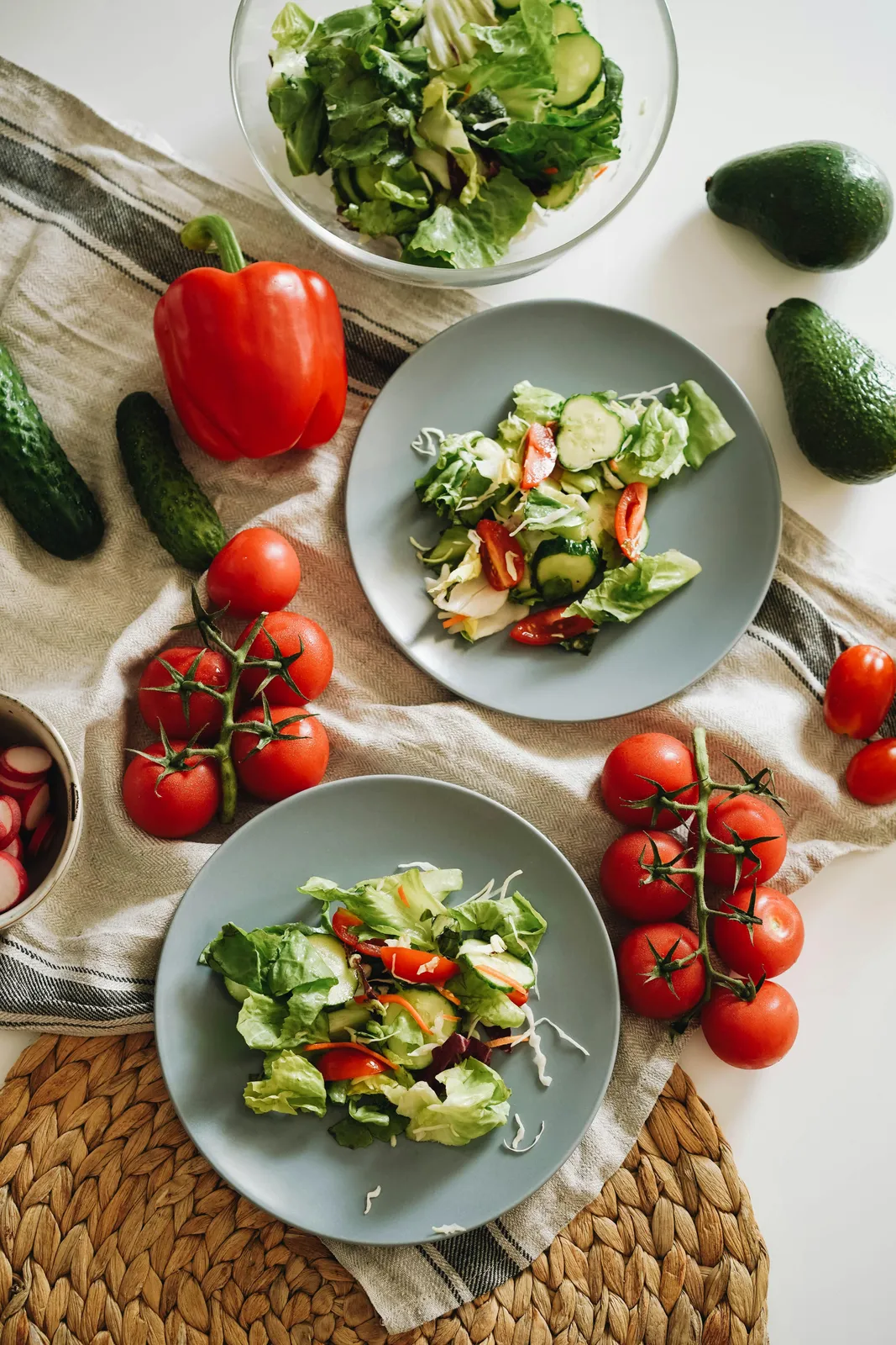
Lupa Verde
ItalianModerately priced0.3 mi
Rated 4.6 out of 5, 2,140 reviews on Google
OpenCloses 11 PM
42 E 20th St, New YorkA place an assistant found for you, in its reply. The photo sits inset in the card, the score and the open hours are one glance apart, and directions, call and website are a tap away. Number it to match a pin on the map.
ItalianModerately priced0.3 mi
Rated 4.6 out of 5, 2,140 reviews on Google
OpenCloses 11 PM
42 E 20th St, New YorkThe preview is yours to explore. Its code comes with a Pro license, paid once and used in every project.
Have a license? Unlock it here
Two blocks. The media frame, and the content column: title, a meta line, rating, hours, address, a line on why it fits and the actions. Drop any part you do not have; the card closes up around the rest.
import {
  PlaceCard,
  PlaceCardMedia,
  PlaceCardContent,
  PlaceCardTitle,
  PlaceCardMeta,
  PlaceCardRating,
  PlaceCardHours,
  PlaceCardAddress,
  PlaceCardDescription,
  PlaceCardActions,
  PlaceCardAction,
} from "@/components/ui/place-card"

<PlaceCard>
  <PlaceCardMedia />
  <PlaceCardContent>
    <PlaceCardTitle />
    <PlaceCardMeta />
    <PlaceCardRating />
    <PlaceCardHours />
    <PlaceCardAddress />
    <PlaceCardDescription />
    <PlaceCardActions>
      <PlaceCardAction />
    </PlaceCardActions>
  </PlaceCardContent>
</PlaceCard>vertical puts a 3:2 photo over the details, for a row of places. orientation="horizontal" puts a square thumbnail beside them, for a short list where a column of tall cards would push the answer off screen.
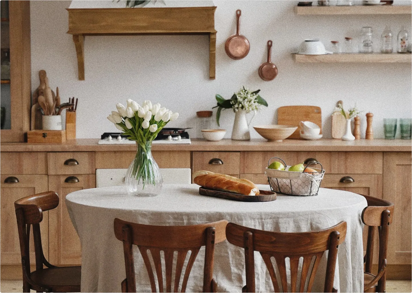
AmericanExpensive0.4 mi
Rated 4.5 out of 5, 1,312 reviews on Google
OpenCloses 10 PM
AmericanExpensive0.4 mi
Rated 4.5 out of 5, 1,312 reviews on Google
OpenCloses 10 PM
PlaceCardHours says whether you can go now. Open reads in the success tone, closing within the hour in warning, closed in the quiet meta ink. The next change in hours follows it: pass it pre-formatted in the place's own time zone, not the reader's.
ItalianModerately priced0.3 mi
Rated 4.6 out of 5, 2,140 reviews on Google
OpenCloses 11 PM

CafeInexpensive0.2 mi
Rated 4.8 out of 5, 868 reviews on Google
Closes soon6 PM
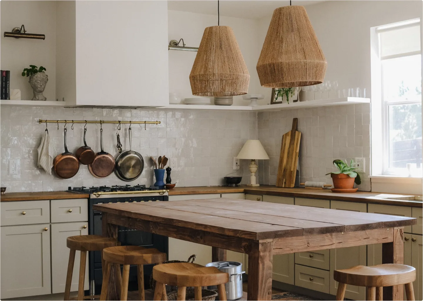
BakeryInexpensive0.5 mi
Rated 4.7 out of 5, 503 reviews on Google
ClosedOpens 7 AM
The answer most assistants give for "where should I go": a map with numbered pins over a row of cards. Give each card its index and each MapPin the same number. Pointing at a card selects its pin; clicking a pin lifts its card and slides it into view. It is a composition of Map, ProductCarousel and Place Card, with one piece of state between them.
5 places open near Flatiron
ItalianModerately priced0.3 mi
Rated 4.6 out of 5, 2,140 reviews on Google
OpenCloses 11 PM
CafeInexpensive0.2 mi
Rated 4.8 out of 5, 868 reviews on Google
Closes soon6 PM
AmericanExpensive0.4 mi
Rated 4.5 out of 5, 1,312 reviews on Google
OpenCloses 10 PM
BakeryInexpensive0.5 mi
Rated 4.7 out of 5, 503 reviews on Google
ClosedOpens 7 AM
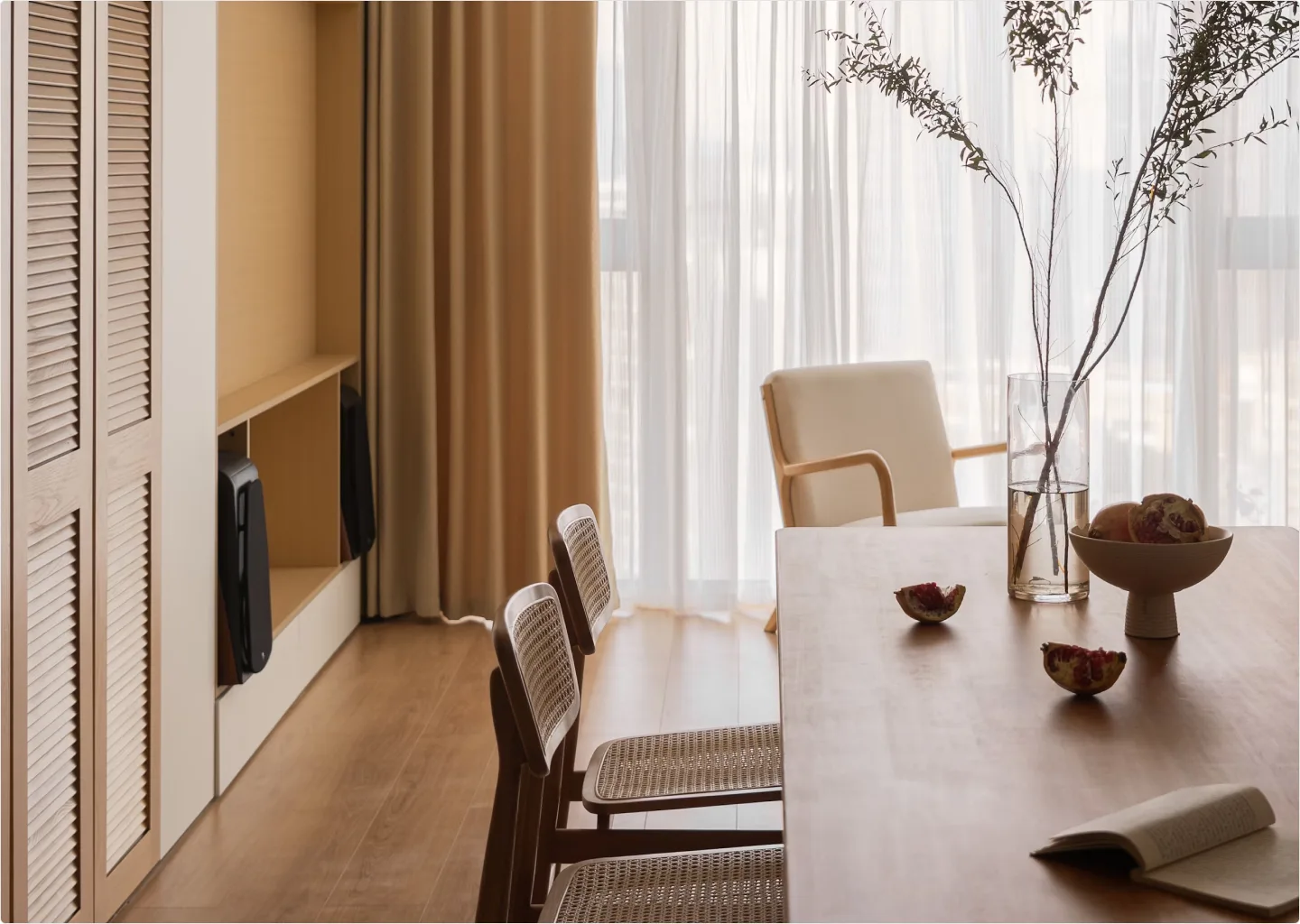
Wine barModerately priced0.6 mi
Rated 4.4 out of 5, 1,904 reviews on Google
OpenCloses 12 AM
Inside a Conversation the cards take the column's width, with no bubble around them. For one or two picks, horizontal cards with a line on why each fits read like a recommendation, not a search result. A labelled Button after the icon actions sits at the end of the row.
ItalianModerately priced0.3 mi
Rated 4.6 out of 5, 2,140 reviews on Google
OpenCloses 11 PM
Seasonal plates and a short list of natural wines. Book ahead for Friday.
Wine barModerately priced0.6 mi
Rated 4.4 out of 5, 1,904 reviews on Google
OpenCloses 12 AM
Small plates until midnight and a bottle list priced like a neighborhood bar.
While a place streams in, PlaceCardSkeleton holds its spot in the same frame, with the photo and the lines where they will land.
The card and the context every part reads. With href the whole card links out through one overlay link, named by the title; the actions sit above it. Every part accepts className, merged last, and every part is droppable. Forwards native <article> props.
| Prop | Type | Default | Description |
|---|---|---|---|
| href | string | - | The place's page: its website, a listing or a booking page. Makes the whole card a link and turns on the hover lift. |
| target | React.HTMLAttributeAnchorTarget | "_blank" | Where the link opens. A new tab by default, announced in the link's name, with rel="noopener noreferrer". |
| linkLabel | string | - | Overrides the link's accessible name, which is otherwise the title and "opens in a new tab". |
| orientation | "vertical" | "horizontal" | "vertical" | vertical puts the photo over the details, for a row of places. horizontal puts a square thumbnail beside them, for a short list or a single pick. |
| index | number | - | The place's number in the answer. Shows as a chip before the title, the same ink as a numbered MapPin, so card 2 reads as pin 2. |
| selected | boolean | false | The place the map is pointing at. The card lifts 4px and its shadow grows, a step past the hover hint. |
| Data attribute | Description |
|---|---|
| data-orientation | The card's orientation. |
| data-selected | Present while selected. |
The photo, inset 8px into the card with a concentric radius and a hairline edge. 3:2 when vertical, a square thumbnail when horizontal; the frame owns the ratio, so pass an aspect-* class to change it. Forwards native <div> props.
| Prop | Type | Default | Description |
|---|---|---|---|
| src | string | - | The photo, cropped to fill the frame. The card renders a plain <img>, so any host works. |
| alt | string | "" | Describe what is in the shot: the room, the dish, the storefront. |
| srcSet | string | - | Responsive sources, so the browser picks one the width of the card. |
| sizes | string | "(min-width: 768px) 280px, 70vw" | Used with srcSet. |
| loading | "eager" | "lazy" | "eager" | Eager by default: a card slid into a carousel moves by a transform, which the browser does not count as scrolling it into view. |
| children | React.ReactNode | - | Your own <img> or overlays instead of src. |
The details column under the photo, or beside it when horizontal. Forwards native <div> props.
The place's name, clamped to two lines, with the index chip in front when the card has one. Labels the card and its link. Forwards native heading props.
| Prop | Type | Default | Description |
|---|---|---|---|
| as | "h2" | "h3" | "h4" | "p" | "h3" | The element, to fit the heading outline of the page. |
One quiet line: what it is, how much it costs and how far it is, joined by middle dots. Pass only what you have. Forwards native <p> props.
| Prop | Type | Default | Description |
|---|---|---|---|
| category | React.ReactNode | - | Italian, Cafe, Bookshop, Museum. |
| price | 1 | 2 | 3 | 4 | React.ReactNode | - | A price level from 1 to 4, drawn as that many symbols and read out as "Moderately priced" and the like. Or your own text ("$20 to $30"). |
| priceSymbol | string | "$" | The symbol a numeric price repeats: €, £. |
| distance | React.ReactNode | - | How far, pre-formatted ("0.3 mi", "450 m"). Set in tabular figures. |
| children | React.ReactNode | - | More segments, each one dotted off from the last. |
One star, the score, the review count in compact form and where the rating comes from: "4.6 (2.1K) · Google". Screen readers hear one phrase with the full count. Forwards native <p> props.
| Prop | Type | Default | Description |
|---|---|---|---|
| value* | number | - | The average score, shown with one decimal. |
| count | number | - | The number of reviews. Shown compact (2.1K), announced in full. |
| source | React.ReactNode | - | Where the score is from: Google, Yelp, Tripadvisor. |
| max | number | 5 | The top of the scale, for the announcement. |
| locale | string | "en-US" | The locale the score and count are formatted in. |
Whether it is open right now, in its tone, then the next change in hours: "Open · Closes 11 PM". Forwards native <p> props.
| Prop | Type | Default | Description |
|---|---|---|---|
| status | "open" | "closing" | "closed" | "open" | open reads in the success tone, closing in warning ("Closes soon"), closed in the quiet meta ink. |
| label | React.ReactNode | - | Replaces the status word, for another language or "Open 24 hours". |
| children | React.ReactNode | - | The next change, pre-formatted in the place's time zone: "Closes 11 PM", "Opens 7 AM". |
| Data attribute | Description |
|---|---|
| data-status | The status. |
The street address on one line, truncated, in an <address>. Forwards native <address> props.
A line or two from the assistant on why this place fits, clamped to three lines in the reading ink. Forwards native <p> props.
The row of actions at the foot of the card, above the overlay link. Icon actions line their glyph up with the text; a labelled Button after them is pushed to the end. Forwards native <div> props.
An icon Button with a tooltip and a 40px hit area. Its accessible name is the action and the place ("Directions, Lupa Verde"), so a row of cards does not read as five identical buttons. With href it renders a link. Forwards Button props.
| Prop | Type | Default | Description |
|---|---|---|---|
| kind | "directions" | "call" | "website" | - | A preset: the glyph, the name and whether the link opens a new tab. call stays in the tab, for tel: links. |
| label | string | - | The action's name and tooltip. Required when there is no kind. |
| href | string | - | Makes the action a link: a maps URL, tel:, the website. |
| target | React.HTMLAttributeAnchorTarget | - | Overrides where the link opens. |
| variant | ButtonProps["variant"] | "subtle" | The Button variant. Subtle keeps the row quiet until the pointer reaches it. |
| children | React.ReactNode | - | Your own glyph instead of the preset's. |
The card's shape while a place is still on its way: the same frame, inset photo and lines, shimmering. aria-hidden; announce the wait on the list around it. Forwards native <div> props.
| Prop | Type | Default | Description |
|---|---|---|---|
| orientation | "vertical" | "horizontal" | "vertical" | Match the cards it stands in for. |