 Koala UI
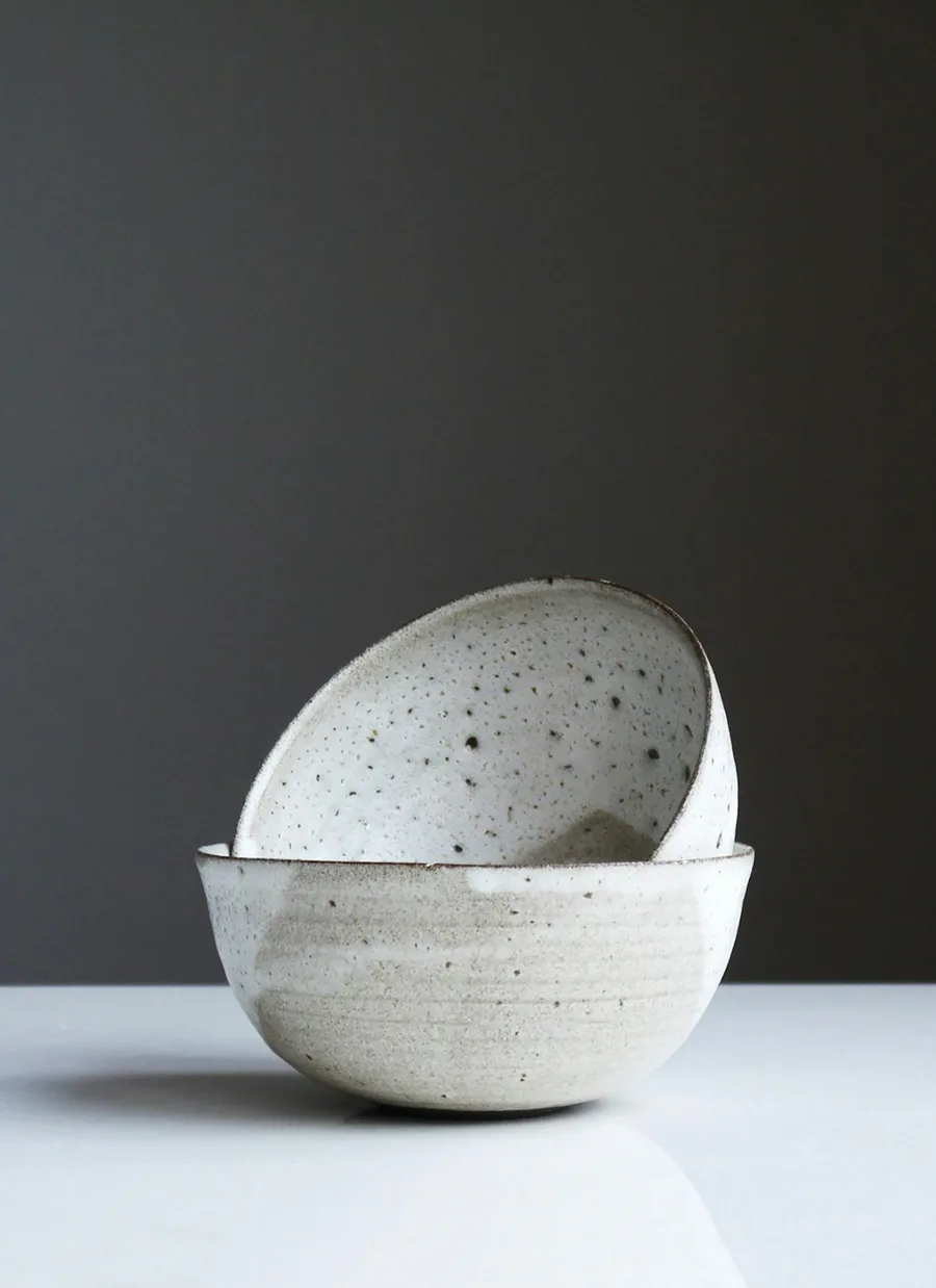 Best seller
East Fork
Speckled Cereal Bowls, Set of 2
1,284 reviews
$48
The row of products an assistant answers a shopping question with. Product Cards snap card by card with the next one peeking, a small header carries the count, the source and the arrows, and results still streaming in hold their place as skeletons.
The preview is yours to explore. Its code comes with a Pro license, paid once and used in every project.
Have a license? Unlock it here
A header with the title and the arrows, then the content row of items, each holding one Product Card. The header is optional: without it the row still drags, swipes and answers the arrow keys.
import {
  ProductCarousel,
  ProductCarouselHeader,
  ProductCarouselTitle,
  ProductCarouselControls,
  ProductCarouselContent,
  ProductCarouselItem,
} from "@/components/ui/product-carousel"

<ProductCarousel>
  <ProductCarouselHeader>
    <ProductCarouselTitle />
    <ProductCarouselControls />
  </ProductCarouselHeader>
  <ProductCarouselContent>
    <ProductCarouselItem>
      <ProductCard />
    </ProductCarouselItem>
  </ProductCarouselContent>
</ProductCarousel>The row starts flush with the reply's text and the next card always peeks past the edge, so it reads as more to see. Each arrow moves one card and stops at the last one instead of leaving a gap; a drag moves with the pointer and a fling skips several cards. Tabbing into a card that is out of view slides it in.
6 results from 6 stores
Best seller$48
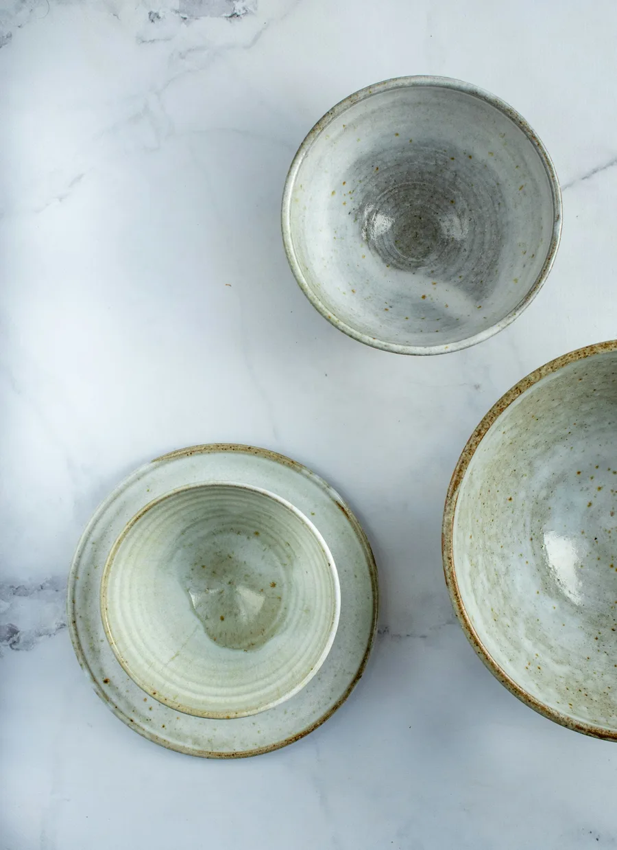 -20%
Now $52, was $65
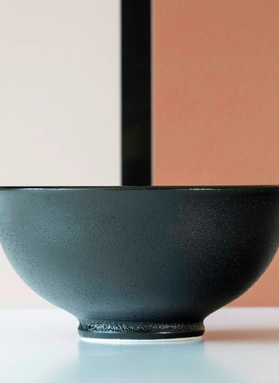
$58
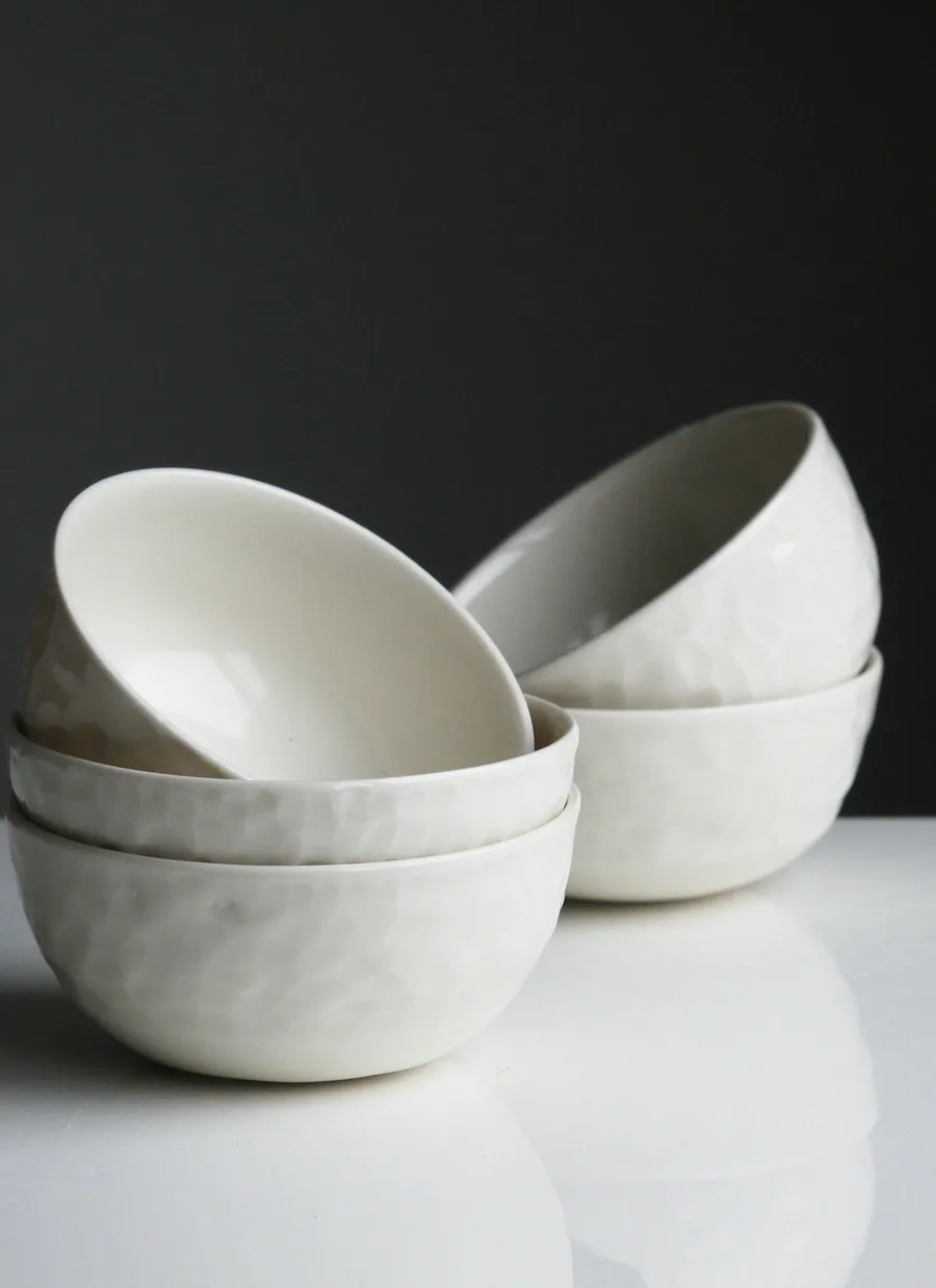
$39.95
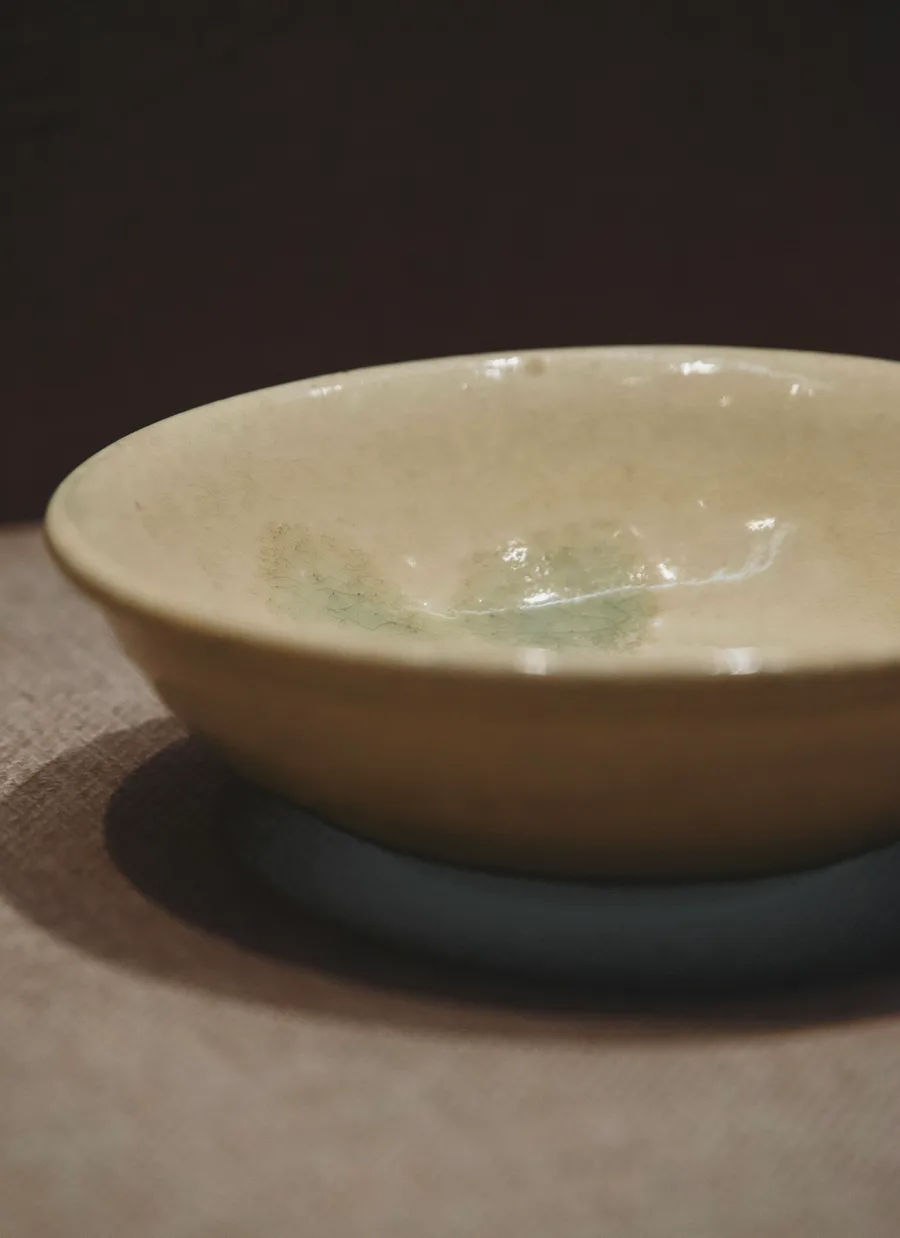 Handmade
$34
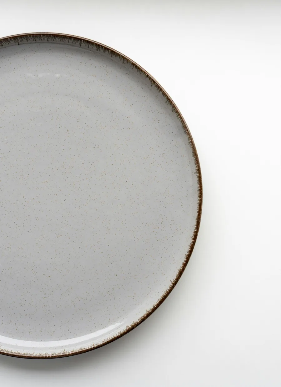
$28
Render the row as soon as you know how many results are coming and mark the ones still on their way loading. Each holds its slot as a skeleton the shape of a card, and resolves in place from a blur when its data lands, so nothing in the row moves while it fills.
When every card fits, there is nothing to page through: the arrows step out of the header and the row stays put, with the cards keeping the width they have in a full row.
2 results from 2 stores
-20%Now $52, was $65
$58
Cards size to the row through a container query, not the viewport, so the same carousel shows about one and a half cards in a 343px reply and three and a half in a wide one. Swipe to move it; the page still scrolls vertically under the thumb.
6 results from 6 stores
Best seller$48
-20%Now $52, was $65
$58
$39.95
Handmade$34
$28
The row and its state. A Carousel root, so it forwards Carousel props (index, defaultIndex, onIndexChange, loop). The arrow keys move it while focus is inside. Every part accepts className, merged last.
| Prop | Type | Default | Description |
|---|---|---|---|
| label | string | "Products" | The row's accessible name. Say what was searched for. |
| Data attribute | Description |
|---|---|
| data-slot | carousel, like the Carousel it is. |
The small bar over the row: the title on the start, the arrows on the end. Droppable. Forwards native <div> props.
What the row is: a count and where it came from. Muted, with <strong> stepping the count up to full ink in tabular figures. Put a Citation inside to link the sources. Forwards native <p> props.
The previous and next arrows, as small outline icon buttons. They disable at either end, and the pair disappears when every card already fits. Forwards native <div> props.
| Prop | Type | Default | Description |
|---|---|---|---|
| previousLabel | string | "Previous products" | The previous arrow's accessible name. |
| nextLabel | string | "Next products" | The next arrow's accessible name. |
| previousProps | CarouselArrowProps | - | Props for the previous CarouselPrevious. |
| nextProps | CarouselArrowProps | - | Props for the next CarouselNext. |
| children | React.ReactNode | - | Your own controls instead of the pair. |
The row itself: a CarouselContent set to peek and align="start". Cards size to the row, not the screen (about 1.5 visible on a phone, 3.5 on a wide reply), so the next one always peeks. It snaps a card at a time, drags and swipes, a fling skips several, and it never runs past the last card. Forwards CarouselContent props (draggable).
One slot in the row, holding a Product Card at the row's height. A CarouselSlide, so it forwards its props.
| Prop | Type | Default | Description |
|---|---|---|---|
| loading | boolean | false | Show a ProductCardSkeleton while the result streams in. When it turns false the card resolves into place from a blur. |
| Data attribute | Description |
|---|---|
| data-loading | Present while loading. |
| data-fresh | Present once a loading slot has resolved: its card plays the entrance on arrival. |