 Koala UI
Generation
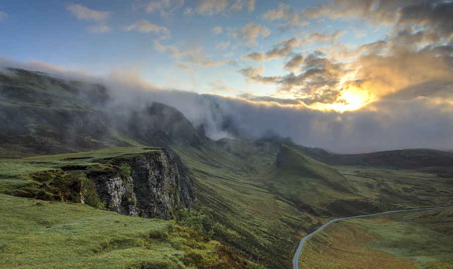
The card a model fills while it paints a picture. The frame is sized by its ratio before there is anything to put in it, so nothing jumps, and the picture comes in from the top out of a halftone field of dots.
A valley at first light, low cloud caught in the pines, long shadows, shot on medium format film
Installation#
Usage#
import {
  Generation,
  GenerationHeader,
  GenerationIcon,
  GenerationLabel,
  GenerationStatus,
  GenerationActions,
  GenerationAction,
  GenerationPrompt,
  GenerationCanvas,
  GenerationImage,
  GenerationCaption,
  GenerationProgress,
  GenerationPercent,
  GenerationOverlay,
  GenerationGrid,
  GenerationFooter,
  GenerationMeta,
} from "@/components/ui/generation"

export function Example() {
  return (
    <Generation status="generating" progress={62} ratio="square">
      <GenerationHeader>
        <GenerationIcon><ImageSquare weight="bold" /></GenerationIcon>
        <GenerationLabel>Image</GenerationLabel>
      </GenerationHeader>

      <GenerationPrompt lines={2}>A valley at first light…</GenerationPrompt>

      <GenerationCanvas>
        <GenerationImage src={src} alt={alt} />
        <GenerationCaption />
        <GenerationProgress />
      </GenerationCanvas>

      <GenerationFooter>
        <GenerationMeta>Flux 1.1 · 1024×1024</GenerationMeta>
      </GenerationFooter>
    </Generation>
  )
}Anatomy#
Four blocks, in reading order. An eyebrow says what kind of card this is (GenerationIcon + GenerationLabel, with a GenerationStatus chip or GenerationActions trailing). A GenerationPrompt quotes back what you asked for. The GenerationCanvas is the frame everything happens inside. A footer carries the meta and whatever you do next.
The frame never resizes. You know how big a picture will be long before you know what is in it, so the canvas takes its ratio up front: the card stands at its final height from the first frame, and nothing below it jumps when the bytes land. The picture is inset 8px from the card's edge with the radius that follows from it (24 − 8 = 16), the same geometry CardMedia uses, so the copy keeps its own, wider measure and the photograph reads as framed rather than as a header band.
A valley at first light, low cloud caught in the pines, long shadows, shot on medium format film
The reveal#
Mount the GenerationImage as soon as you have a URL, not when you are finished. Everything below it sits under a halftone screen whose holes open as progress climbs. At 62% you are looking at the picture through a plate that is 62% open — everywhere at once, the way a halftone resolves when you step back from it. The percentage stops being a number beside the picture and becomes the picture.
It glides rather than marches. The reveal is a registered custom property (--generation-reveal), which means a percentage that CSS can interpolate: a model reporting 40 → 62 → 100 reads as one continuous movement, and finishing just carries the number to 100, so the last stretch wipes in instead of cutting. Report no percentage at all and there is nothing to wipe to — the frame simply works at full size and a bar goes indeterminate, which is the honest reading.
The screen is the frame's own ground with two layers of one 12px dot grid drawn on it — small dots everywhere, large ones in the middle — breathing on a registered --generation-dot radius, so the plate swells and settles like something being worked on. The holes are punched half a cell off the dots, so they open between them and the dots are the last thing left standing. It is the part the frame keeps for itself: nothing to compose, nothing to remember to remove.
Nothing sweeps, nothing is tinted, and nothing travels in a direction. A shimmer passing over the frame, a blurred veil, a brand-coloured field, a lit hairline and a top-to-bottom wipe were each built and each thrown out: every one read as an effect laid over the work rather than as the work. A line crossing a picture reads as a scanner passing over it. The dots are plain ink at 30%, so they re-theme by themselves and leave the picture as the only coloured thing in the card.
Drag the percentage below to take the reveal at your own pace. Note the demo sets transition="none": a frame driven continuously — a slider under your finger, a stream reporting every frame — shouldn't ease, or it trails a third of a second behind you and reads as lag. It is the same axis, for the same reason, that Progress carries.
States#
One status on the root moves the whole card: idle → generating → complete, or failed. Only the frame changes. While it works, the halftone screen sits over the picture and breathes; as the percentage climbs its holes open, and at 100% there is no plate left — the frame simply holds a photograph.
The state parts know when they aren't wanted. GenerationCaption and GenerationProgress render nothing once the picture is there; GenerationOverlay renders nothing until it is. Not hidden, not transparent — not in the DOM. So you leave all three in your markup unconditionally and never write a ternary around them.
Variations#
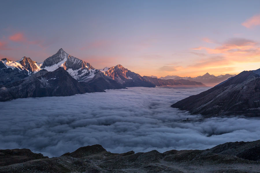
GenerationGrid lays a batch out as a contact sheet, two to four across. Each GenerationCanvas takes its own status, because a real batch comes back one tile at a time — so each frame keeps its own shimmer and settles when it is ready. Tiles land a beat apart rather than all at once, which is the difference between a sheet developing and four boxes appearing.
A valley at first light, low cloud caught in the pines, long shadows, shot on medium format film


Ratios#
ratio on the root sizes the hero frame and every tile of a sheet at once: square, portrait (3:4), landscape (4:3), wide (16:9), tall (9:16), or auto when the height comes from the layout around it. A single GenerationCanvas can overrule it — a landscape hero over a square sheet is the common pair.
In a chat turn#
variant="plain" drops the ring, the shadow and the gutter so a generation sits inside a Chat turn or an AIPanel body as part of the answer rather than as a card inside a card. The picture then takes the full measure of the turn: there is nothing left for it to be inset from, so the inset lets go too.
API reference#
Generation
The root and the provider. Takes status?: "idle" | "generating" | "complete" | "failed" (default complete), progress?: number | null (percent, or null for a model that reports none), ratio, variant?: "card" | "plain", transition?: "smooth" | "none" (how the reveal reacts to a new percentage), density and asChild. Sets aria-busy while generating.
GenerationCanvas
The frame. Takes its own ratio, status and progress to overrule the root for one frame — which is how a sheet of variations comes in tile by tile, each at its own pace. It owns the halftone screen, the edge ring over the picture, and it pins a GenerationProgress dropped inside it to the bottom edge.
GenerationImage
The picture, under the screen: it fades up as its bytes decode, and the screen over it opens as the percentage climbs. Mount it as soon as you have a URL, not when you are finished. Change the src and it all happens again, so a regenerate reads as the same frame being re-exposed. Forwards all img props; a cached image that was already complete before React saw it still fades in rather than staying blank.
GenerationCaption / GenerationPercent / GenerationProgress / GenerationOverlay
The parts that come and go with the state, none of which needs a ternary around it. GenerationCaption is the line inside an empty frame, with the glyph its state implies — pass null for a thumbnail with no room for words. Then pick one readout: GenerationPercent, a chip in the corner of the frame (a Badge in the overlay tone, so it holds on a photograph), or GenerationProgress, a hairline pinned to the bottom edge that composes Progress and so inherits the indeterminate sweep. A bar and a number saying the same thing is the same news twice. GenerationOverlay holds the tools that arrive over a finished picture, and reveals on touch as well as hover.
GenerationGrid
A sheet of frames, columns?: 2 | 3 | 4 (default 2, and two columns hold on a phone). It staggers its tiles' entrances in CSS, so nothing is cloned onto the children.
Layout parts
GenerationHeader, GenerationIcon, GenerationLabel, GenerationStatus (a Badge derived from the root's status), GenerationActions / GenerationAction (a ghost icon Button wrapper — pass tone="onMedia" over a picture), GenerationPrompt (takes lines?: 1 | 2 | 3), GenerationFooter and GenerationMeta. Every part is droppable: a generation renders correctly with any subset of them.