
Ultimate Guide and Best Practices for Using Icons in UX/UI
Selecting the right icon library is crucial for maintaining consistency, enhancing user experience, and facilitating scalability in projects. A good use of icons can drastically improve design, but a misuse of icons can also worsen it, so use them responsibly.
.jpg)
Introduction
Icons are probably one of the most important elements throughout the interface or UI. They serve as visual cues that help users quickly understand functions, actions, or content within an application or website.
Depending on the type of icon and how we use them, we can create one design or another. Usually, decisions about the type of icon are made at the beginning of the project depending on the branding, the mood we want to convey, etc. For example, using playful and colorful icons might be suitable for a children's app, while sleek and minimalist icons might be more appropriate for a professional business platform.
Aspects to Consider When Choosing an Icon Library
Icons determine the mood and appearance of the project, so we must consider certain things:
Selecting a Library from the Project's Start
It's important to choose the library from the outset so that once the project grows, we don't have to backtrack and change everything.
Choose a Library Consistent with Your Branding and Ecosystem
One of the most common mistakes I see in projects is that the icon library is very disconnected from the product. If we have a playful brand dedicated to learning, like Duolingo's overall look, the icons must be illustrative; they can't be simple vectors with straight edges.
Every library and icon style is different, so make sure you choose the one that fits best.

Choose a Sufficiently Large Library
A very common mistake is using a very limited library: At the beginning, you won't have any problems, but later, if the project expands, you'll start encountering issues.
Ideally, it should have between 500 and 1000 icons, and preferably with 4 variants: Regular, Bold, Mini, Duotone.
This will allow you to tackle any project.

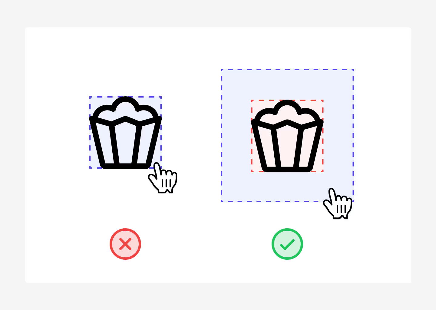
Touchable Area
When designing, especially when dealing with icons, we must consider the touchable area. What is this? Well, let me explain: When a user interacts with an icon, usually if we do nothing, the icon has a box of 24px by 24px. This means that, for example, in a dropdown, if we want it to expand when clicked, we must click inside that 24px x 24px box.
However, this poses several usability problems, and the experience is not very good. If you look at most applications or websites, you'll see that when the user interacts with the icon, the icon actually has an invisible box of at least 48px around it, which is activated only when the cursor hovers over it.
What's the difference? - Well, very simple: When you hover over a 24px tooltip with a 48px box, the tooltip will actually activate much sooner.
Let's see an example.
What Should You Avoid?
This isn't really a dealbreaker, you can do it if you want, but I don't recommend it. And yes, I'm talking about creating your own icon library.
I know that as designers, sometimes we're eager, and we want everything we do to be done by ourselves and as customizable as possible.
Just as you wouldn't design the typography you'll use on your website, I also don't recommend designing your own icon library.
Why? Well, it's simple - Why would you dirty your hands with something that will give you headaches, knowing that there are people much more professional and experienced than you who have already done the hard work for you?
In these cases, it's better not to reinvent the wheel and always use open-source icon libraries, or you can opt for premium libraries. Another option, if you want, is to hire a professional icon designer; there the situation changes because you're delegating this task to a professional specialist.
In fact, if you have a budget for the project, I recommend it; it will give an extra sense of customization and professionalism to the project.
And of course, it goes without saying that you shouldn't modify them either; use them as they are.
What Should You Do? Best Practices
A common question in the UX/UI world is what sizes should I use for my icons:
16px, 18px, 20px, 24px?
I recommend considering 3 things:
- The fewer sizes, the better. That is, if I can do everything with 20px, great, if I have to use 20px and 24px, it's okay, but let's try not to go beyond that.
- Use sizes based on the 4-pixel grid, i.e., sizes only: 16px, 20px, 24px, 28px, 32px, 36px… Your project should already be based on the 4px grid; it's the best practice for maximum consistency, so your icons should align with that as well.
- Caption text usually is 14px with a 20px line height - therefore, for caption text, use the 20px icon size. Body text is usually 16px 24px, so here use 24px.
It's advisable to use the icon size according to the text height; this will ensure that when you have a button, the button's height is determined by the elements' height. If the icon has the same height as the text, this will ensure that when one of the two elements is absent, the button's height remains unchanged, without the need for a fixed height on the component (which then causes problems in responsiveness).
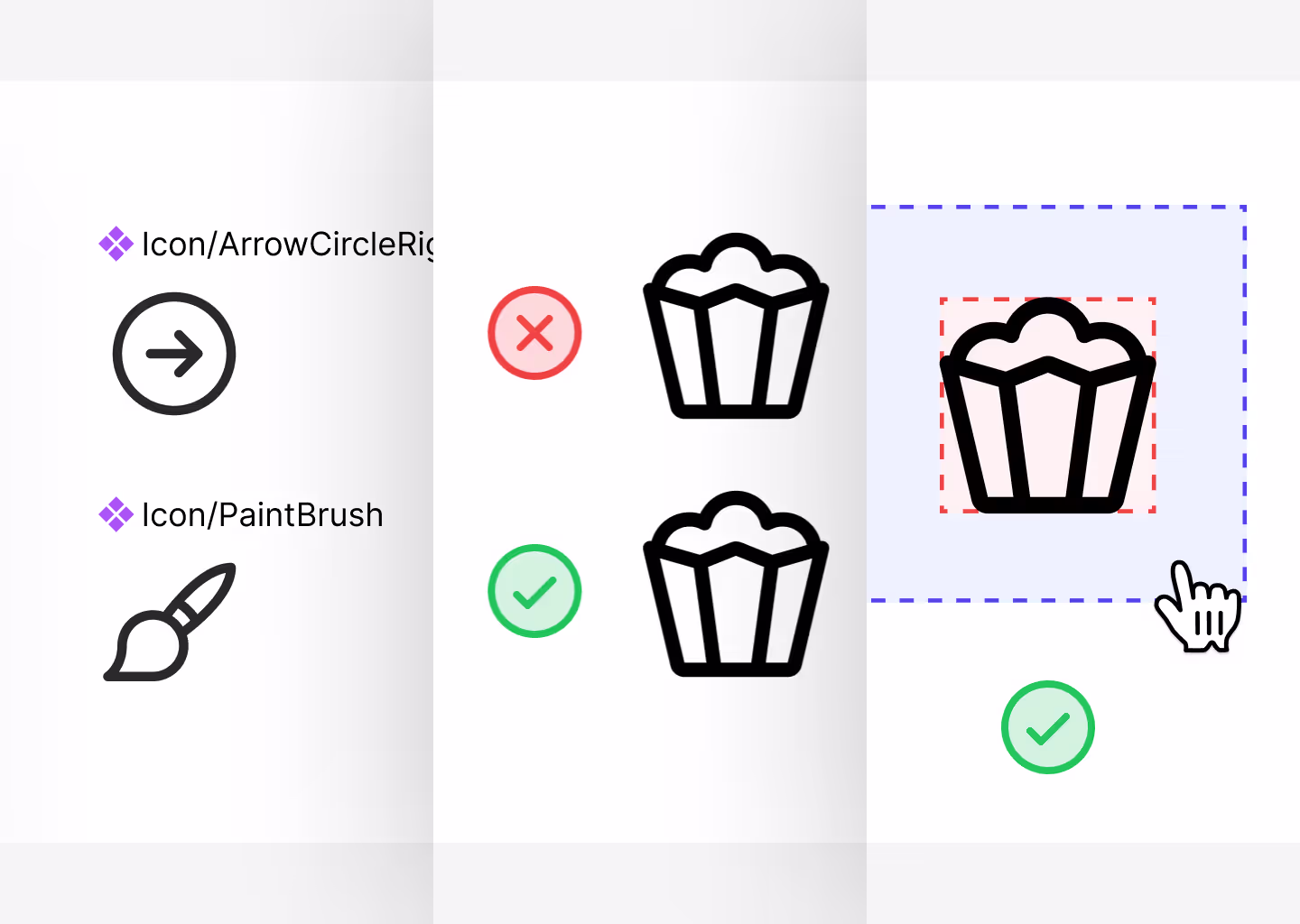
Maintain the Same Structure
One of the problems that exist in Figma today is that we have an icon on the button with a white color, and then when we go to replace the icon, suddenly the icon changes color.
This is basically because they don't have the same names. Always try to:
- Icon name + vector
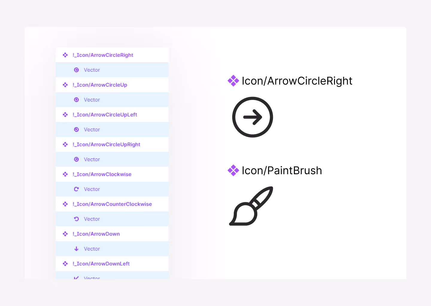
What Names Should They Have?
Sometimes we find that libraries have icons named after the object, and others named after the function they perform, i.e.,
- Icon/Gear
- Icon/Settings
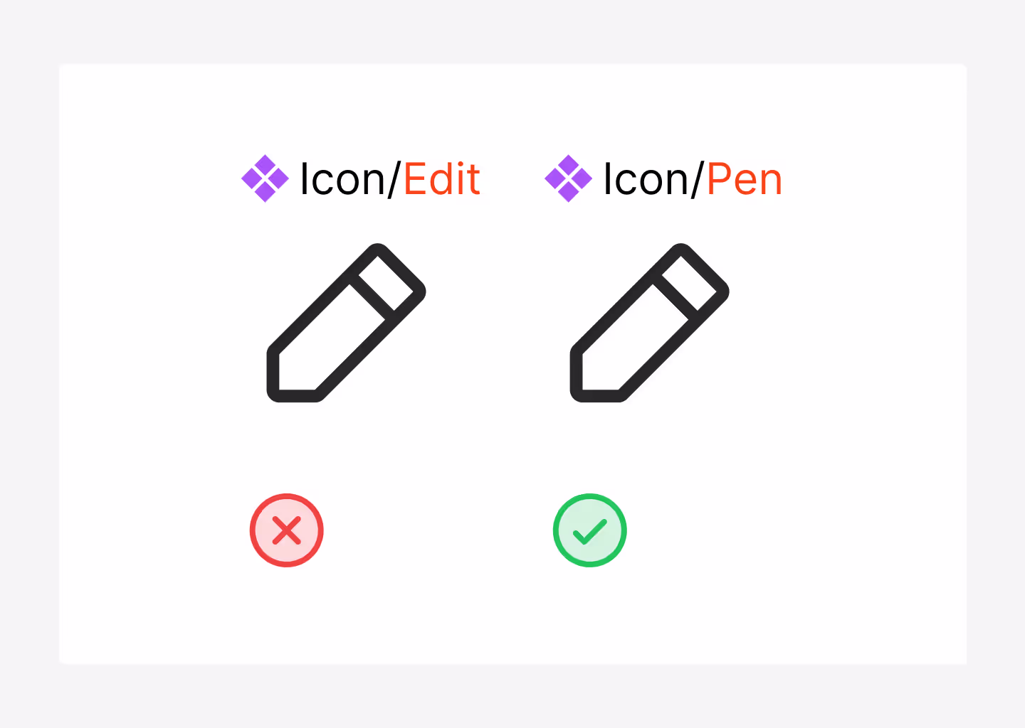
I recommend always using the descriptive name - Icon/Gear. Because you don't really know if you'll always use that for settings or something else. That is:If I call the question mark icon Icon/Help instead of Icon/QuestionMark, what if I want to use that icon for a tooltip instead of help and then for a contact button?
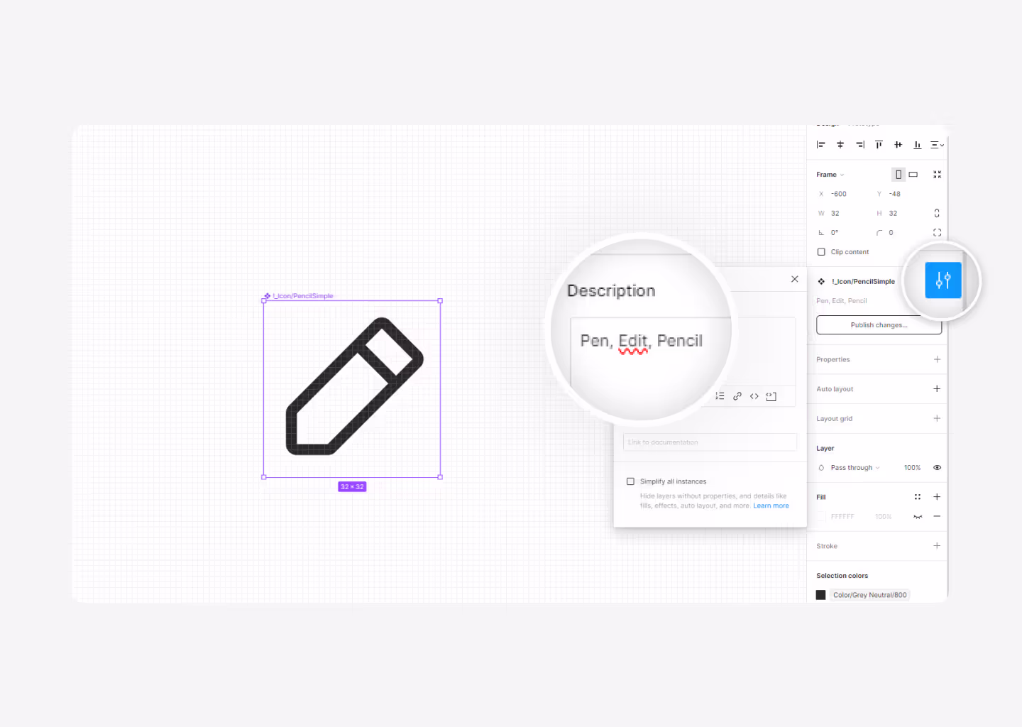
So always use the descriptive icon name, and if you want, add other names to the icon's description so you can easily find it by other names.
Icon Format
So, icons in .png, .jpg, or .svg? Whenever possible, export them in .svg; it's the best-optimized format without losing quality. Basically because we work with vectors and not pixels.
JPEG (.jpg):
- Description: JPEG (Joint Photographic Experts Group) is a commonly used method of lossy compression for digital images, particularly for those images produced by digital photography.
- Usage: JPEG is ideal for photographs and complex images with many colors. It's widely used on the web and in digital photography because it compresses the file size while maintaining a relatively high image quality.
PNG (.png):
- Description: PNG (Portable Network Graphics) is a raster graphics file format that supports lossless data compression. It was created to improve upon and replace GIF (Graphics Interchange Format) as an image-file format not requiring a patent license.
- Usage: PNG is well-suited for images with text, line art, and images with transparency. It supports a full range of color depths, including indexed-color, grayscale, and true color, and it also supports alpha transparency.
SVG (.svg):
- Description: SVG (Scalable Vector Graphics) is an XML-based vector image format for two-dimensional graphics with support for interactivity and animation. SVG images can be created and edited with any text editor, but they are more often created with drawing software.
- Usage: SVG is best suited for graphics that require scalability without losing quality. It's widely used for logos, icons, illustrations, and other graphics on the web. Because SVG files are based on XML, they can be edited with code, allowing for dynamic changes and interactions.
Each format has its strengths and best use cases depending on the type of image and how it will be used. JPEG is great for photographs, PNG is ideal for images with transparency, and SVG is excellent for scalable vector graphics that need to maintain crispness at any size.
However, there are developers who will suggest you make the icon part of the font typography. This is a good option; instead of importing them, we use them as part of the font. This helps developers to apply the same icons with few lines of code, gaining speed.
Best Libraries
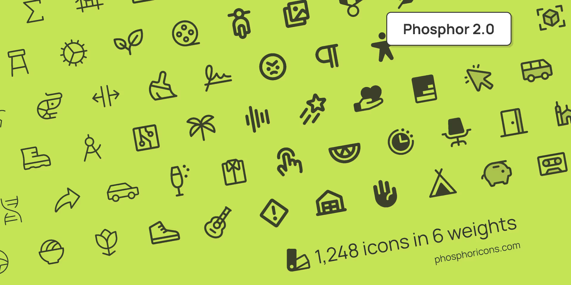
1. Phosphor Icons
This is personally one of my favorites and the one Koala UI is based on. What we like the most is its versatility and the ability to tackle all sorts of projects. Most of the projects we undertake in the studio, whether they're serious, fun, for mobile, web, etc., always use Phosphor icons.
This library is made by two geniuses: Tobias Fried and Helena Zhang.
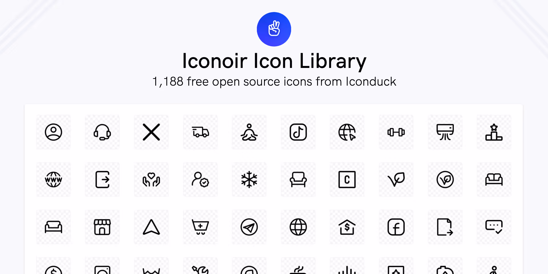
2. Iconoir
Iconoir is one of the best libraries available today, created by @burgioluca, simply because of the number of icons it offers, how well they are constructed, its compatibility with React Native and CSS, and moreover, it's a completely free library.
When we're not using Phosphor icons, we use Iconoir. Highly recommended.
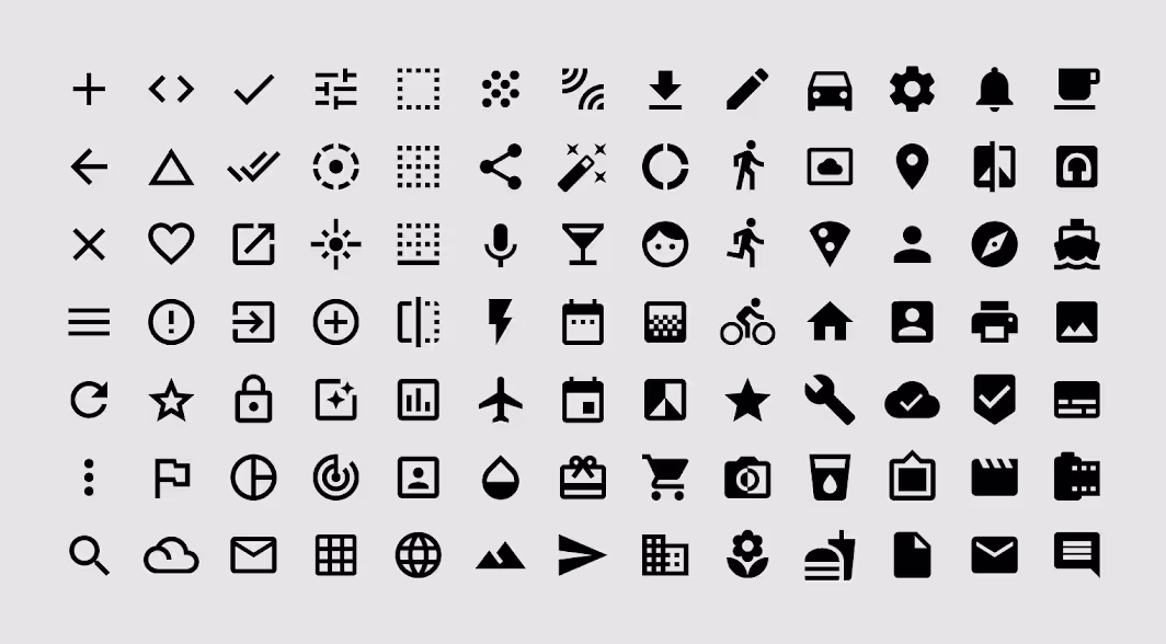
3. Google Icons
And finally, as it couldn't be otherwise, the Google library. We know that Google excels in everything, and indeed they are also excellent at designing icons.
Personally, I really appreciate the variety and versatility of these icons. Moreover, if you ever doubt which library to use, what could be better than using Google's own library, right?
Conclusion
In conclusion, selecting the right icon library is crucial for maintaining consistency, enhancing user experience, and facilitating scalability in projects.
A good use of icons can drastically improve design, but a misuse of icons can also worsen it, so use them responsibly.


