
Top 3 Free Figma Icon Libraries for UX/UI and Design Systems in 2024
Icons are probably one of the most important elements throughout the interface or UI. They serve as visual cues that help users quickly understand functions, actions, or content within an application or website.
.jpg)

Introduction
Icons are probably one of the most important elements throughout the interface or UI. They serve as visual cues that help users quickly understand functions, actions, or content within an application or website.
Depending on the type of icon and how we use them, we can create one design or another. Usually, decisions about the type of icon are made at the beginning of the project depending on the branding, the mood we want to convey, etc. For example, using playful and colorful icons might be suitable for a children's app, while sleek and minimalist icons might be more appropriate for a professional business platform.
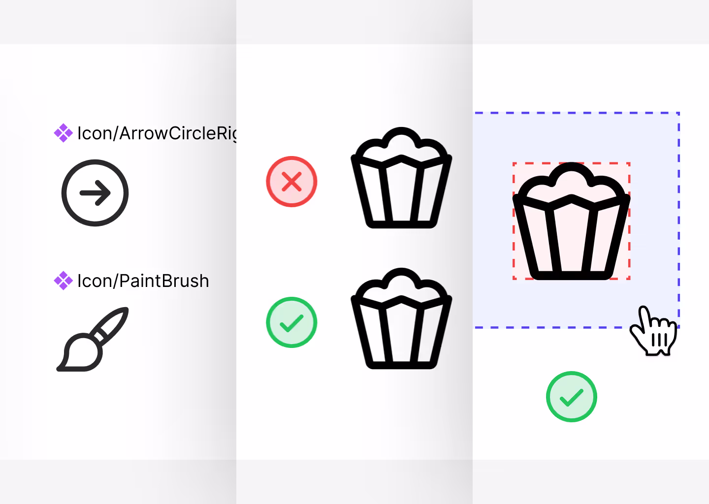
There are many types of icons, and typically in each library, we find 4 different modes: Regular, Bold, Mini, and Duotone. Regular icons offer a standard style, while Bold icons provide a more prominent and impactful appearance. Mini icons are scaled-down versions suitable for smaller UI elements, and Duotone icons add depth and dimension with two-tone colors.
Having this variety of icons allows us to customize the designs even more, tailoring them to specific visual identities and user experiences. This flexibility is crucial for creating cohesive and engaging interfaces that resonate with users.
In today's article, we bring you 3 libraries of free icons for any UX/UI project or for your Design System in 2024. These libraries offer a wide range of icons covering various categories, ensuring you have access to the right visuals for your design needs. Whether you're working on a mobile app, a website, or a digital product, these resources can help enhance the user experience and streamline the design process. Let's explore these libraries and see how they can elevate your projects to the next level.
Aspects to Consider, Best Practices, and Tips
If you want to learn thoroughly about icons, we have prepared a guide in another article so that you can apply these icons in the most correct way possible. Here is the article for you.
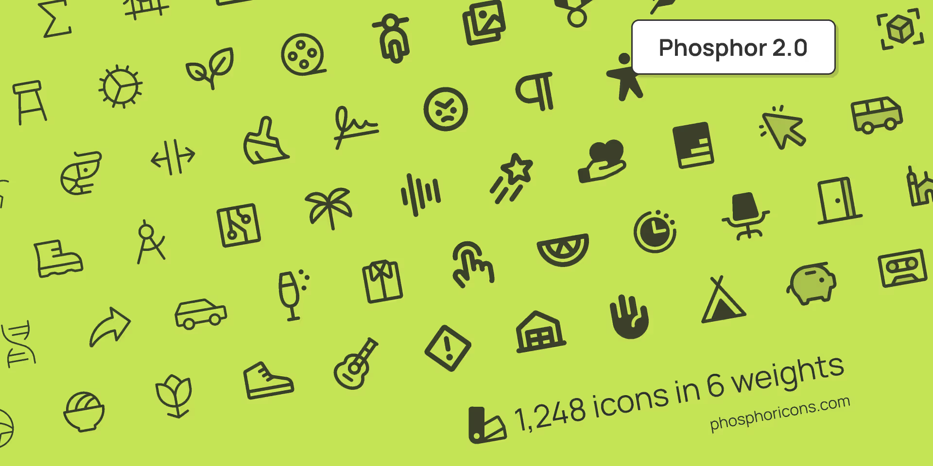
1. Phosphor Icons
This is personally one of my favorites and the one Koala UI is based on. What we like the most is its versatility and the ability to tackle all sorts of projects. Most of the projects we undertake in the studio, whether they're serious, fun, for mobile, web, etc., always use Phosphor icons.
This library is made by two geniuses: Tobias Fried and Helena Zhang.
Link: phosphoricons.com
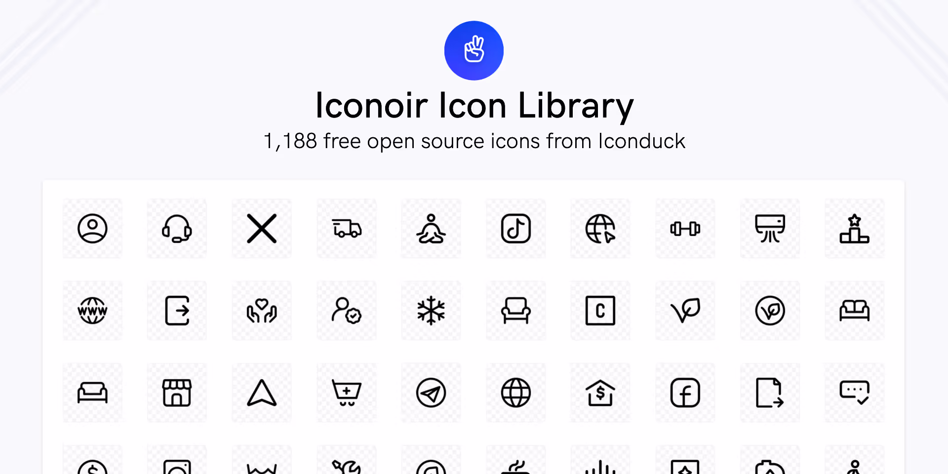
2. Iconoir
Iconoir is one of the best libraries available today, created by @burgioluca, simply because of the number of icons it offers, how well they are constructed, its compatibility with React Native and CSS, and moreover, it's a completely free library.
When we're not using Phosphor icons, we use Iconoir. Highly recommended.
Link: iconoir.com
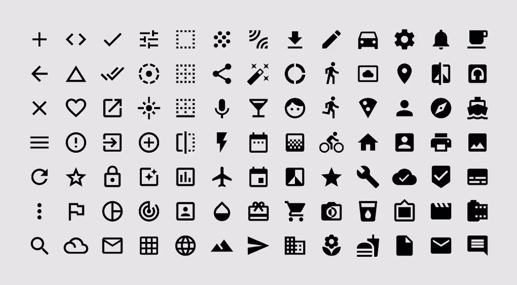
3. Google Icons
And finally, as it couldn't be otherwise, the Google library. We know that Google excels in everything, and indeed they are also excellent at designing icons.
Personally, I really appreciate the variety and versatility of these icons. Moreover, if you ever doubt which library to use, what could be better than using Google's own library, right?
Link: fonts.google.com/icons
And that's it for today's article. We hope you enjoyed it! If you did, feel free to share it with your friends or colleagues so they can enjoy it too.


