
Steps
A numbered procedure for guides and docs. Each step pairs a title with any content you need, from a paragraph to a code block, a callout or an image, threaded on one quiet rail.
Initialise the project
Run
initonce. It adds the design tokens and the helpers every component imports.npx koalaui-cli@latest initFonts come along
Init wires the Koala faces too: Inter for UI and body, DM Sans for headings.
Add a component
The CLI copies the source into your project, with its dependencies, so you own the code.
npx koalaui-cli@latest add buttonUse it
Import it from your components folder like any other file.
save.tsxTSXimport { Button } from "@/components/ui/button" export function Save() { return <Button>Save changes</Button> }
Installation#
Usage#
Steps is for reading, not for moving through a flow. When each step is a screen the user completes, reach for Stepper instead. Steps numbers itself, so reordering or removing a step never leaves a gap.
import { Steps, Step, StepTitle, StepContent } from "@/components/ui/steps"

export function SetupGuide() {
  return (
    <Steps>
      <Step>
        <StepTitle>Create a project</StepTitle>
        <StepContent>
          <p>Name it and pick a region close to your users.</p>
        </StepContent>
      </Step>
      <Step>
        <StepTitle>Connect your repository</StepTitle>
        <StepContent>
          <p>Every push to main deploys a preview.</p>
        </StepContent>
      </Step>
    </Steps>
  )
}Anatomy#
import { Steps, Step, StepTitle, StepContent } from "@/components/ui/steps"

<Steps>
  <Step>
    <StepTitle />
    <StepContent />
  </Step>
</Steps>
Rich content#
StepContent is a column with an even gap, so paragraphs, lists, keyboard shortcuts, code blocks, callouts and images stack on the same rhythm without margins of their own.
Turn on two-step sign-in
Open Settings, then Security, and switch on Verification code. Press ⌘ , to jump straight there.
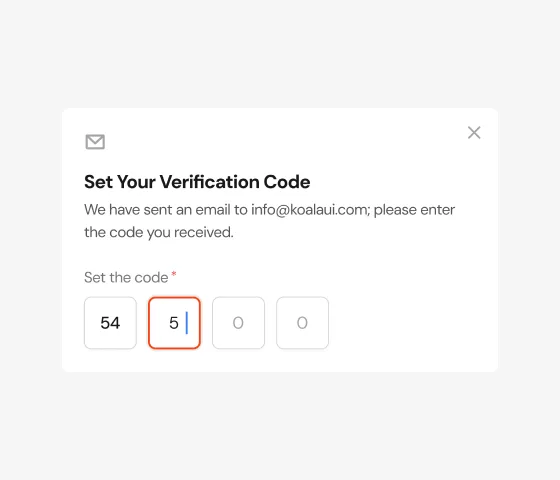
Enter the code we send you
We email a four digit code to the address on your account. It expires after ten minutes.
Keep your recovery codes
Download the codes and store them somewhere safe. Each one signs you in once if you lose access to your email.
- A password manager
- A printed copy at home
Sizes#
md is the default, for a guide page. sm tightens the marker, the type and the gaps for a side panel, a dialog or an onboarding card. The marker always matches the title's line height, so it sits on the first line at either size.
Create a project
Name it and pick a region close to your users.
Connect your repository
Every push to main deploys a preview.
Invite your team
Members get access to every environment.
Create a project
Name it and pick a region close to your users.
Connect your repository
Every push to main deploys a preview.
Invite your team
Members get access to every environment.
Headings and anchors#
Titles render an h3. Set as to fit your page outline, and give a Step an id to link to it from a table of contents. The step keeps clear of a sticky header when you jump to it.
Import the parts
import { Steps, Step, StepTitle, StepContent } from "@/components/ui/steps"Compose the guide
One Step per action, a title that starts with a verb, and whatever the step needs below it.
Start#
Continue a procedure across sections with start. The markers and the list read by screen readers count from the same number.
Activate your Pro license
Once per machine. The key is in the email you got with your purchase.
npx koalaui-cli@latest login <key>Add a Pro component
npx koalaui-cli@latest add data-grid
Without titles#
Every part is optional. Drop StepTitle for a short procedure where each step is one sentence; the text lines up with its marker.
- Open the invoice you want to refund.
- Pick the lines to refund and check the total.
- Confirm. The customer gets an email with the credit note.
API reference#
Steps
An <ol> that numbers its Step children with a CSS counter. Forwards all native <ol> props; accepts className, merged last.
| Prop | Type | Default | Description |
|---|---|---|---|
| size | "sm" | "md" | "md" | md for guide pages, sm for panels, dialogs and cards. Sets the marker, the type and the gaps. |
| start | number | 1 | The number of the first step. Applied to the list and to the markers. |
| Data attribute | Description |
|---|---|
| data-slot | steps. |
| data-size | The size passed. |
| CSS variable | Description |
|---|---|
| --steps-marker | The marker's diameter, equal to the title's line height. |
| --steps-gap | The space between one step and the next. |
| --steps-stack | The gap between the blocks inside StepContent. |
Step
An <li> with its number marker and the rail down to the next step. The last step has no rail. Forwards all native <li> props, id included for table-of-contents anchors; accepts className.
| Data attribute | Description |
|---|---|
| data-slot | step. The marker is step-marker. |
StepTitle
The step's heading, on the marker's line. Forwards all native heading props; accepts className.
| Prop | Type | Default | Description |
|---|---|---|---|
| as | "h2" | "h3" | "h4" | "h5" | "h6" | "p" | "h3" | The element to render, to fit the page outline. |
| Data attribute | Description |
|---|---|
| data-slot | step-title. |
StepContent
A column for anything the step needs: paragraphs, lists, code, callouts, images. Stacks its children on an even gap. Forwards all native <div> props; accepts className.
| Data attribute | Description |
|---|---|
| data-slot | step-content. |